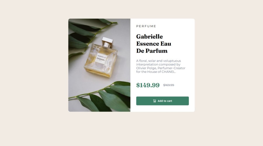
Design comparison
SolutionDesign
Solution retrospective
What are you most proud of, and what would you do differently next time?
I'm proud the way I did this and the excellent time management doing this. That was great!!
What challenges did you encounter, and how did you overcome them?I have some problems with the H1 because in desktop was supposed to be with some line jumps, and on mobile just two. But i barely fixed showing another H tag to make it work.
What specific areas of your project would you like help with?Responsive design and font styling
Community feedback
- @john-miragePosted about 1 year ago
Hello, nice work !!
Here some ways you can improve your project:
- In the <head> of your project, you loaded more fonts than the project need, you can remove the links who are not needed.
- To help you start a project, you can add a css reset file. It defines some rules to ease your workflow.
- You can add meta tags in your <head> element to display informations and an image for Google and the social medias like facebook and twitter.
- The product images can be converted in webp format, webp format compress images more so you get less loading time.
- Check out the BEM methodology, it can help you for the naming of your classes
- You forget to add a favicon in the <head> element.
Marked as helpful1
Please log in to post a comment
Log in with GitHubJoin our Discord community
Join thousands of Frontend Mentor community members taking the challenges, sharing resources, helping each other, and chatting about all things front-end!
Join our Discord
