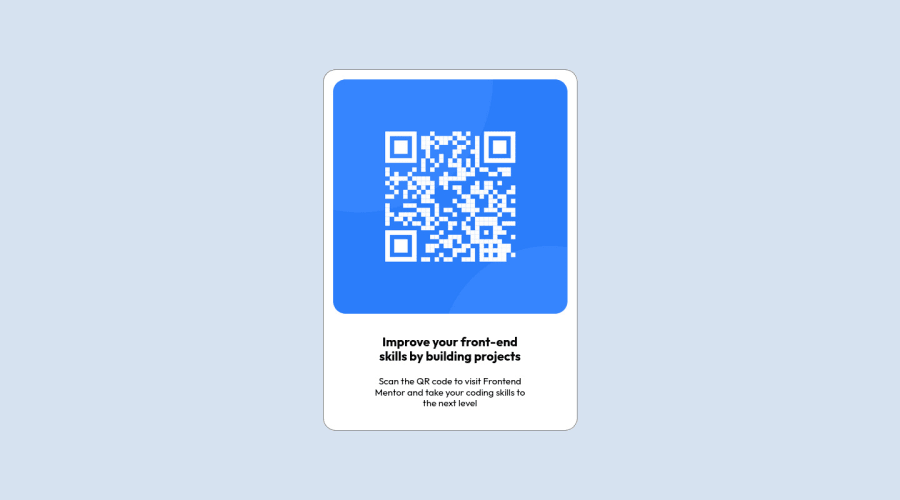
Design comparison
Solution retrospective
Hi, I found centering the design and defining the width the same as the width of the screen a little bit challenging.. I will appreciate a lot if you can review my solution and return me with
- errors / incomplete parts
- inefficiencies and what could be better written (if the solution is correct)
Thanks.
Community feedback
- @amulyalovescodingPosted over 2 years ago
Hello mehmet Alptekin Isiklar, Congratulations on completing this challenge! I really liked the result of your project, but I have some tips that I like to share:
1- Every page should have one main landmark <main>. So replace the div that wraps the whole content with <main> to improve the accessibility. click here
2- All page content should be contained by landmarks, you can understand better by clicking here: click here
3- Bad value `` for attribute
srcon elementscript: Must be non-empty. Context:</div> </scri4- Consider adding a
langattribute to thehtmlstart tag to declare the language of this document. Context:TYPE html><html><head>You can go through my solution if you like click here
✌️ I hope this helps you. Happy Coding.
Marked as helpful1@aisiklarPosted over 2 years ago@amulyalovescoding Hi, thank you for reviewing my code and giving valuable comments. I will work on your remarks and make the necessary changes in the shortest time. Happy coding to you as well. Kind regards
1 - @aisiklarPosted over 2 years ago
Hi guys, I made some changes according to review notes. Thanks
0
Please log in to post a comment
Log in with GitHubJoin our Discord community
Join thousands of Frontend Mentor community members taking the challenges, sharing resources, helping each other, and chatting about all things front-end!
Join our Discord
