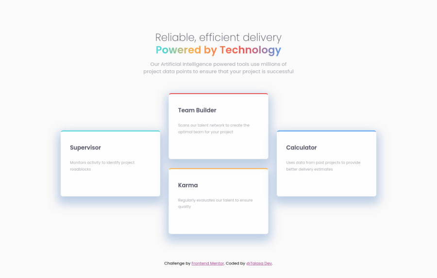
Design comparison
Solution retrospective
Hi everyone,
I was wondering if I could get some feedback about different layouts options for this challenge.
I used display: grid and grid-template-columns: 1fr 1fr 1fr for desktop screen size and for mobile screen size I changed grid-template -columns: 1fr.
Thank you. Happy coding!!!
Community feedback
- @VCaramesPosted almost 2 years ago
Hey there! 👋 Here are some suggestions to help improve your code:
- Your HTML code is missing a
mainandheaderelement to help improve semantics and accessibility.
- The “Reliable, efficient delivery Powered by Technology” is one single heading so the entire thing should be wrapped in a single
h1heading along with aspanelement.
- Along with the blank
Alt Tag, you also want to include thearia-hidden=“true”to your “icons” to fully remove them from assistive technology.
- Using
CSS GridwithGrid-Template-Areaswill make things way easier when building the layout; it will give you full control of the layout.
Here is an example of how it works: EXAMPLE
- Implement a Mobile First approach 📱 > 🖥
With mobile devices being the predominant way that people view websites/content. It is more crucial than ever to ensure that your website/content looks presentable on all mobile devices. To achieve this, you start building your website/content for smaller screen first and then adjust your content for larger screens.
If you have any questions or need further clarification, feel free to reach out to me.
Happy Coding!🎄🎁
0 - Your HTML code is missing a
Please log in to post a comment
Log in with GitHubJoin our Discord community
Join thousands of Frontend Mentor community members taking the challenges, sharing resources, helping each other, and chatting about all things front-end!
Join our Discord
