

Design comparison
SolutionDesign

Solution retrospective
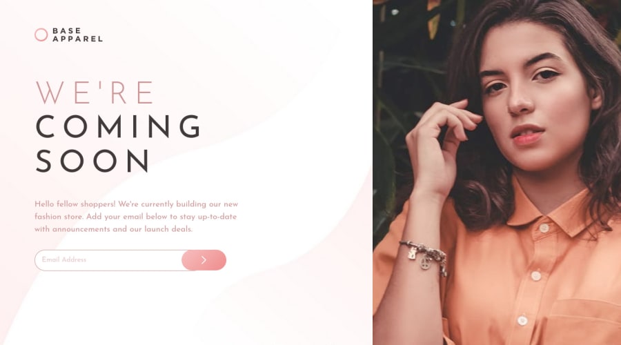
Surprisingly, it took me longer than I expected to make the page fully responsive. Please let me know if you see any issues that need to be fixed. Thanks! :)
Community feedback
- @Mod8124Posted over 2 years ago
Hello, nice job! the image could look better if you use
.right-side {
    background-image: url(/images/hero-desktop.jpg);
    background-repeat: no-repeat;
    background-size: cover;
    background-position: center center;
}
and delete
.right-side {
      background-size: 100vh;
    object-fit: cover;
}
also in mobile you can use on .left-side__text margin : 0 auto; for center the div
Marked as helpful1@la-vizaPosted over 2 years agoHi @Mod8124! Thank you very much for the suggestions -- it helped!
0

Please log in to post a comment
Log in with GitHub
Join our Discord community
Join thousands of Frontend Mentor community members taking the challenges, sharing resources, helping each other, and chatting about all things front-end!
Join our Discord