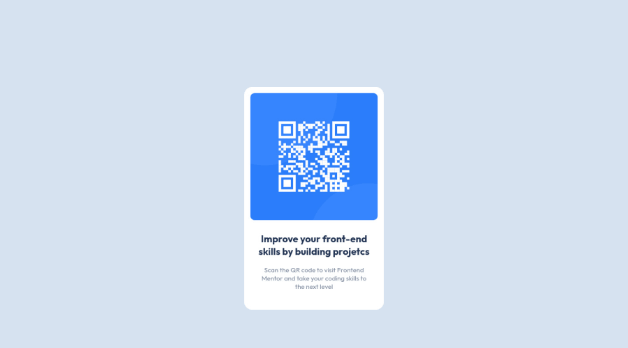
Design comparison
Solution retrospective
Hello everyone! I've just completed the "QR code component" challenge and to be honest I don't know what I did wrong but looks like the size of the page is different. I'm a newbie in Front End, just finished one course of HTML5 and CSS basics, if someone has some time could you please give some tips on what I did wrong, any feedback and suggestions on how I can improve are very welcome!
Community feedback
- P@perezjprz19Posted about 3 years ago
Hmm... your solution looks great. Just try giving the body
        height: 100vh;
       display: flex;
       justify-content: center;
      align-items: center;
Marked as helpful1@Cooly-o-CatsPosted about 3 years ago@Adriana2710 What @peperezjprz19 said should fix it, but maybe add
overflow: hidden;Marked as helpful0@grace-snowPosted about 3 years ago@Cooly-o-Cats don't use overflow hidden on this! Big accessibility issues from that
And use min-height not height. If you change base text size, zoom or use a mobile device especially in landscape view these things make a big difference. Think what 100vh is on mobile landscape vs portrait for example. Height would limit things to be that tall, min height would let them grow beyond the 100vh if they needed to
Marked as helpful1 - @grace-snowPosted about 3 years ago
Hello
First, this solution looks great! So these are just optimisation ideas, not things that are "wrong"
-
This doesn't really need a media query. If you set max width on the card and make sure it has a little margin (or its outer wrapper has a little padding) so it can't touch screen edges that would be the same code for all screen sizes.
-
I'm not sure you're understanding when to use padding vs margin. Maybe read up on the box model. Padding should be on the card, it stops things hitting the edges of their wrapping element. Margin top or bottom is then used on the inner elements to vertically space items inside the card like headings and paragraphs. Margin will 'collapse' meaning you could have margin bottom on a heading and margin top on the paragraph below and those margins would share that space (as long as they are not children of a flex element). If you used padding to separate those elements, the paddings would be added together creating double the space
If you wanted a cool snippet for creating vertical space between child elements you can even do something like this:
.card > * + * {
  margin-top: 1rem;
}
That's saying give every direct child of the card some margin top except the first child. The only downside to that technique is it's very specific css so makes it harder to override if you wanted to change a margin on one element inside
I hope this is interesting and helpful for you. Good luck on the next one!
Marked as helpful0@Adriana2710Posted about 3 years ago@grace-snow Hi Grace, thank you for your time and tips, very helpful! <3
0 -
- @arkharman12Posted about 3 years ago
Impressive work! 👏
0
Please log in to post a comment
Log in with GitHubJoin our Discord community
Join thousands of Frontend Mentor community members taking the challenges, sharing resources, helping each other, and chatting about all things front-end!
Join our Discord
