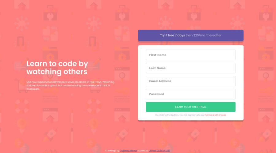
Responsive Web Form built with - HTML5, CSS3(Flexbox), JS, SASS, BEM
Design comparison
Solution retrospective
Hi front end mentor community 😄,
This is project #3 and it definitely went smoothly. Got the website to look good on mobile (portrait and landscape), and desktop, as well as successfully implementing the active states. I had to use inline CSS styling to get the outlines of the input element to be red when an error was made. I know that CSS styling should be confined to our stylesheets but this seemed like the simplest way to get the desired effect. Did anyone do it another way?
Any feedback in regards to the readability of my code would be greatly appreciated. 👍🏽
Happy coding! 😄
Community feedback
- @JamesTheLessFCPosted about 3 years ago
Hi @jameslegoff92, Nice job on this! To change the styles of your input element when there is an error present (without using inline styles), you could create a class for inputs with errors and apply the class when an error is found. Something like this:
//stylesheet input.errors { outline-color: red; } //validator function document.getElementById("email_input").classList.add("errors");1@jameslegoff92Posted about 3 years ago@JamesTheLessFC Thanks a lot for the response 👍🏽 Definitely going to be using this for in the future.
0 - Account deleted
good effort, there is just a one problem the body width is bigger than the screen the size you can fix it remove clear the width: 100vw from body
0
Please log in to post a comment
Log in with GitHubJoin our Discord community
Join thousands of Frontend Mentor community members taking the challenges, sharing resources, helping each other, and chatting about all things front-end!
Join our Discord
