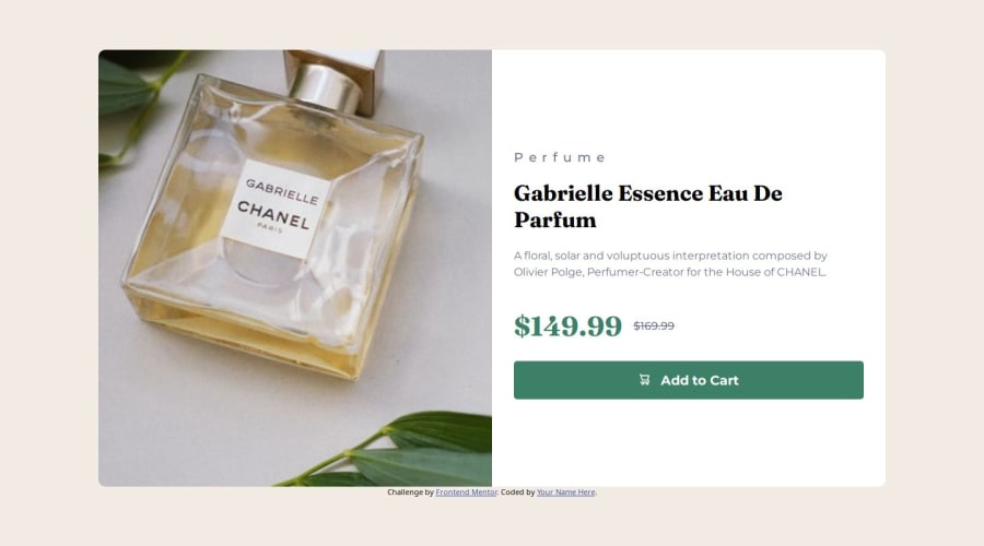
Design comparison
Solution retrospective
I made the web's design different for mobile and desktops using @media query. i still need to learn how to use it properly though. I tried to use BEM system
What challenges did you encounter, and how did you overcome them?for the width of the mobile users it went fine. For the website, i had some problems with it. When it comes to the width and the height of the .protect-box, i had some difficulties with it. The elements inside the box (texts and image) went outside of the box.
What specific areas of your project would you like help with?Can you look at my media queries? is the css optimized with the structure and the codes? For the @media screen and (min-width: 600px) i need help with. whenever i made the height of the website smaller, the .product-box__text-box elements went outside the box. Everything went outside the box except the image. The button and the texts went outside of the box when the height of the website got smaller. Do you have any suggestions to help me with?
Community feedback
- @SvitlanaSuslenkovaPosted 7 months ago
.product-box {width: 80vw; max-height: 80vh;} - you should add max-width in rem or px here to stop endless drowth. Also max-height: 80vh; gives you nothing here you can consider or not to use it at all or add something like height: 80vh; max-height: some rem... But very often you don't need height at all because it depends on padding and content inside.
img { max-height: 80vh; height: 80vh;} - same problem. Change max-height value to rem or px you need it to stop it's growth at
0
Please log in to post a comment
Log in with GitHubJoin our Discord community
Join thousands of Frontend Mentor community members taking the challenges, sharing resources, helping each other, and chatting about all things front-end!
Join our Discord

