Responsive web design with flexbox and media queries


Design comparison

Solution retrospective
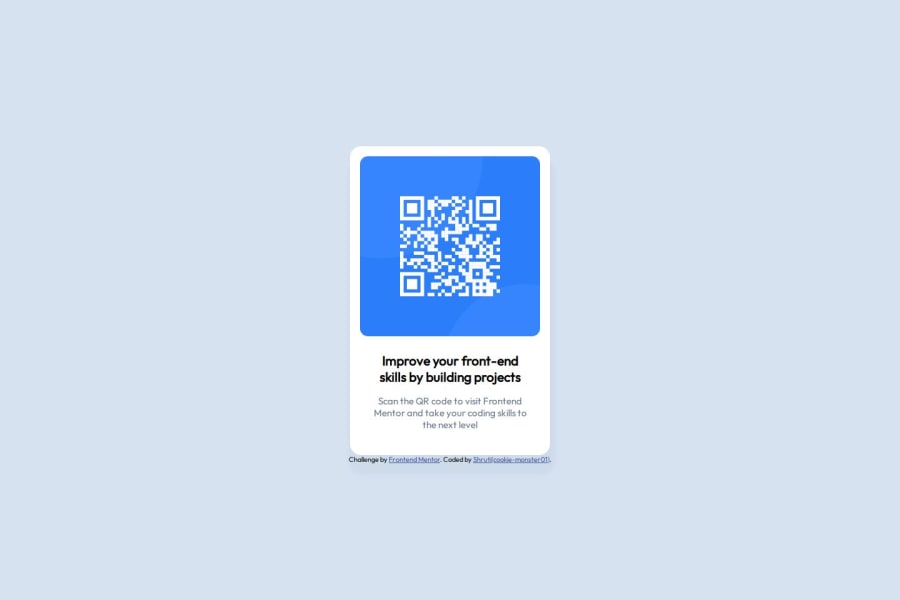
The project itself was easy, I was able to use both flexbox, media queries for a responsive design. I have used and for enclosing the content within it. I have used id attribute on section called #main and have used a class .first-division. I have created a separate CSS file for styling, called app.css. Both #main and .first-division have a display of flex, #main has a flex-direction of row, while .first-division has flex-direction of column, and have applied justify-content to flex-start. I have provided #main with a padding of 115px on top and bottom to be able to center the .first-division. I have used padding and scale to increase the size as well as to manage white space as per the reference on and . I have also used to positioning to shift content to the top relatively. I have used media queries at 580px, 480px and 375px.
What challenges did you encounter, and how did you overcome them?I was using max-width property but not box-sizing property to control the flow of the content. I remembered to apply it, and it worked better.
What specific areas of your project would you like help with?I believe I come to the same results with more number of steps, maybe i would like examples of how i could have done it differently in a fewer steps, or what could have been more efficient solution.
Community feedback
- @grace-snowPosted 6 months ago
I'm afraid you need to rewrite quite a bit of this, especially the CSS. The scale property has made this inaccessible and non-responsive. It is unreadable. You don't need to do any of this complicated stuff you've added. It's really important to build robust solutions that everyone can access. Don't try to micromanage the code.
- In HTML all content should be contained within landmarks. This is a single component demo but it's good practice to still wrap it in a
mainlandmark so you build the habit and don't miss it out later. - The image on here is the most important content on the page. That means it must have an alternative description that is accurate. This needs to say what the image is (QR code) and where it goes (to FrontendMentor.io).
- as this is a single card that would never serve the main title of the webpage that tells you it should not have an h1. Choose a level with a lower importance like H2.
- get into the habit of always including a full modern CSS reset at the start of the styles in every project you do. Andy Bell or Josh Comaeu both have good ones you can look up and use.
- the body doesn't need width 100vw. As soon as you add that anywhere all that can do is cause overflow problems. Because viewport units don't account for Device notches or the width of scrollbars, meaning 100vw actually equates to the full width of the screen plus the width of the scroll bar when it's present.
- the body also doesn't need overflow scroll. Let it overflow be automatic.
- to centre a component on the page use flex column properties. That wrapping element such as body main can have a small amount of padding in pixels so that the content never hits screen edges.
- don't style on IDs. That's not what they're for. IDs have very important purposes in html. Keep CSS specificity low by using Single class selectors as much as possible.
- the image doesn't need most styles you've added. All it needs is border radius and the standard styles that would be part of a CSS reset anyway Display block and Max width 100%.
- components max width should be in rem and not pixels. This allows the layout to scale correctly for all users including those who have a different text size setting in their browser or device.
- the component should have some padding on all sides.
- main shouldn't have background colour or a shadow.
- remove the huge padding from main.
- remove all scale properties.
- remove all media queries.
- remove all position relatives and directional properties.
- make sure you understand the difference between padding and margin. The usage here is unusual. I've written a post about this if you want to read more: https://fedmentor.dev/posts/padding-margin/
I hope this is helpful. Take your time and refactor this fully, all of these changes are pretty much essential. The key learning points are to focus on keeping everything simple, think through the HTML elements carefully, use a CSS reset at the start, and only add the minimal styles that you need.
1P@cookie-monster01Posted 6 months ago@grace-snow Thank you so much for taking out time and giving me such a detailed feedback, will also go through the article mentioned. This is super helpful!.
0 - In HTML all content should be contained within landmarks. This is a single component demo but it's good practice to still wrap it in a
- @Youssef-fPosted 7 months ago
I like the way you used the media query and the scaling.
0@grace-snowPosted 6 months ago@Youssef-f this is inaccessible and unreadably small. This challenge shouldn't have any media queries or unnecessary complexity.
0@Youssef-fPosted 6 months ago@grace-snow I agree with you, there is no need for media queries just i want it to fit the exact same proportions as the figma file design.
0@grace-snowPosted 6 months ago@Youssef-f and it can do that fine without any of that. Look through the feedback above and you’ll see how.
0


Please log in to post a comment
Log in with GitHub
Join our Discord community
Join thousands of Frontend Mentor community members taking the challenges, sharing resources, helping each other, and chatting about all things front-end!
Join our Discord