Responsive Web Design Using Html and CSS only.
Design comparison
Solution retrospective
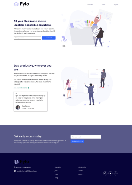
I want to know if this is the best practice for writing the code for this project? Or is it a clean code I wrote? The logo picture is not showing on the live demo but is showing on my localhost. Does anyone know why? Making Global components was a lot of fun, if there is a better way to write or think about them, please inform me.
Community feedback
- @brodiewebdtPosted over 2 years ago
This is your code for the Social Media links
<div class="social-media"> <i class="fab fa-facebook"></i> <i class="fab fa-twitter"></i> <i class="fab fa-instagram"></i> </div>
This is how I coded it:
<ul class="social"> <li> <a class="circle" href="#" aria-label="Facebook link"> <i class="fab fa-facebook-f"></i> </a> </li> <li> <a class="circle" href="#" aria-label="Twitter link"> <i class="fab fa-twitter"></i> </a> </li> <li> <a class="circle" href="#" aria-label="Instagram link"> <i class="fab fa-instagram"></i> </a> </li> </ul>
Hope this helps. David
Marked as helpful1@obaidash99Posted over 2 years ago@brodiewebdt
Thank you sir for your help, my project now has zero accessibility issues.
Waiting to hear from you about my future projects. Obaida
0@brodiewebdtPosted over 2 years ago@obaidash99 Your welcome. Glad I could help. Download AXE DevTools and you can clear accessibility warnings while you code. https://www.deque.com/axe/devtools/ https://chrome.google.com/webstore/detail/axe-devtools-web-accessib/lhdoppojpmngadmnindnejefpokejbdd?utm_source=deque.com&utm_medium=referral&utm_campaign=axe-devtools_pricing_free
0 - @brodiewebdtPosted over 2 years ago
Nice job with this. Your logo isn't showing because you forgot to add the dot in front of the path to the images folder. Your other images have it, which is why they are showing up.
To clear the accessibility issues, wrap all of your main content in a main tag and change the ALL YOUR FILES text to an H1. Every page should have an H1. You can style it however you want it to look. Don't use Headings according to their size. You can always re-style them. You also want to avoid skipping Heading sizes as well. Change your div class of footer to an actual Footer tag since this is a footer. You can leave Headers and Footers out of the Main tag since they have semantic meaning already.
Add the code aria-label="Facebook link" or whatever describes it to links that only show icons for screen readers. That should clear all of the accessibility warnings.
Hope this helps. David
Marked as helpful1@obaidash99Posted over 2 years ago@brodiewebdt
Glad to hear such a great opinion.
I Fixed the Logo issue and wrapped the content in the main tag as you said and for the header and footer, I put each in its tag.
I didn't get the aria-label="Facebook link" issue you mean? could explain, please?
Thank you very much. Obaida
1
Please log in to post a comment
Log in with GitHubJoin our Discord community
Join thousands of Frontend Mentor community members taking the challenges, sharing resources, helping each other, and chatting about all things front-end!
Join our Discord