Responsive Web Design

Solution retrospective
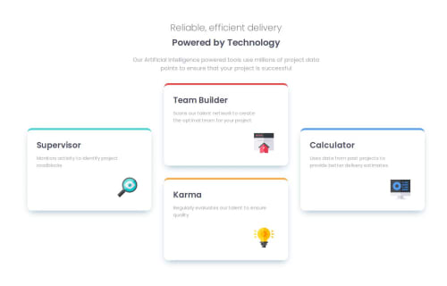
I am proud I manage to some problems I met at the end of the project. I could not arrange the four section in the way how it looks like on the template. Finally I did it, using position and setting the width of the whole container. I also expected to do it faster, but ok. I can accept the whole time to finish the design
What challenges did you encounter, and how did you overcome them?The biggest challenge was to arrange the four sections. As I wrote I did it with position. Maybe it is not the next solution, but I am glad that it works properly. Certainly, if someone has a better solution for this part of the project, and wants to share - I am open for the conversation, and will grateful for an advice
What specific areas of your project would you like help with?I think I have already characterised the main issue. Maybe it is not a big problem, but every advice/tip is at a premium
Please log in to post a comment
Log in with GitHubCommunity feedback
No feedback yet. Be the first to give feedback on Katarzyna Kaźmierczak's solution.
Join our Discord community
Join thousands of Frontend Mentor community members taking the challenges, sharing resources, helping each other, and chatting about all things front-end!
Join our Discord