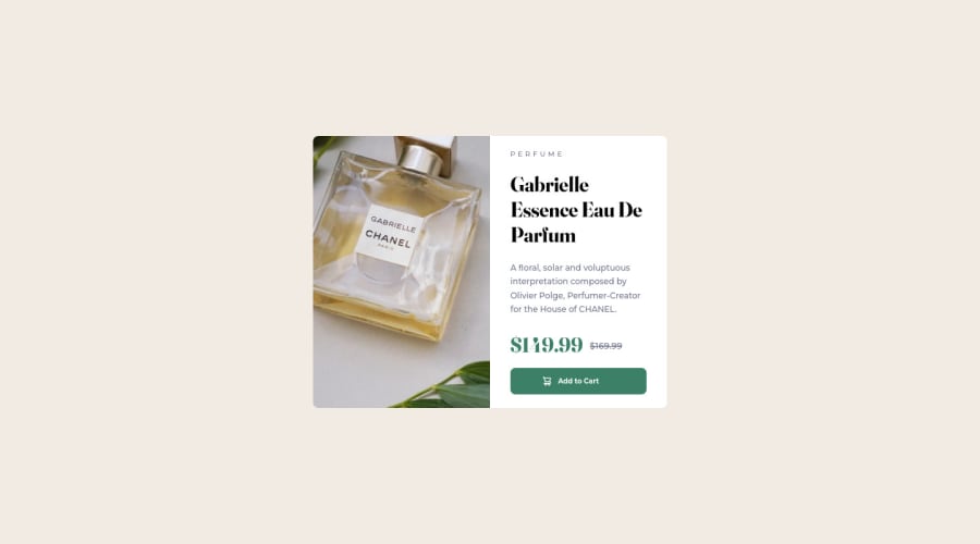
Responsive Web Design built in 0.75 md : Grid, BEM + Passion


Design comparison

Solution retrospective
-
Please review code and let me know if I can improve upon any area of code ?
-
This project is built in just 3/4 of a working day, but I feel still there is areas of improvement wrt width, height and grid related techniques.
Thanks in advance.
Please log in to post a comment
Log in with GitHubCommunity feedback
- @correlucas
Hello Vikram Ingleshwar! Congratulations for your new solution!
Your solution seems great. You've done a good job with the GRID and the media queries. There's only two minor details your can adjust to have your solution more accurate in comparison to the design files (starter files).
-
Note that you've insert the background inside you element with the class .grid-container, its better you insert the
background-color<body>to display it filling all the screen. Apply to the bodyheight: 100vhto make sure your background will fill all the screen. -
Align your main component applying flex to the body with these properties
display: flex; align-items: center; justify-content: center;
See the changes I've done to your code below:
body { display: flex; align-items: center; justify-content: center; height: 100vh; background: var(--clr-primary-cream); }I hope these tips help you Vikram, then you can say me if these changes fixed the background/position behavior. Happy coding.
Marked as helpful -

Join our Discord community
Join thousands of Frontend Mentor community members taking the challenges, sharing resources, helping each other, and chatting about all things front-end!
Join our Discord