Submitted 9 months ago
Responsive Web app , Mobile first, using Grid, Flex, AOS-(animations)
@zetmosoma10
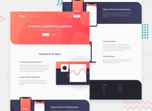
Design comparison
SolutionDesign
Solution retrospective
What are you most proud of, and what would you do differently next time?
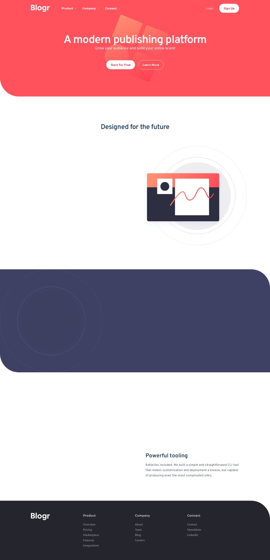
It was nice and fun building this page, i learned a lot about Tailwind and Animations and React as whole. the button component has 3 variations ( outline, white, red) Any feed back on this app will be appriciated.
Build this page with 1 - Grids ( each section was build with 2 column grid and 4 for footer) 2- Flex (Navbar ) 3- AOS (Animation On Scroll library)
What specific areas of your project would you like help with?I need help on the positioning of the phone, laptop and computer and hero background images, i couldn't position them the way they are in the design.
Community feedback
Please log in to post a comment
Log in with GitHubJoin our Discord community
Join thousands of Frontend Mentor community members taking the challenges, sharing resources, helping each other, and chatting about all things front-end!
Join our Discord
