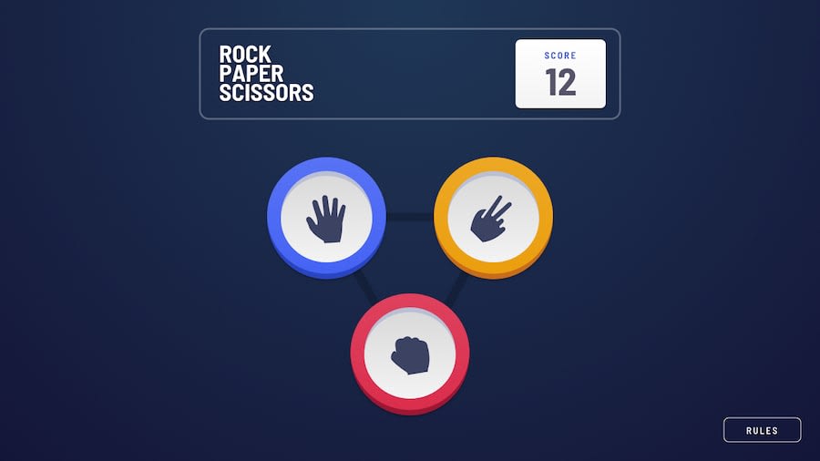
Responsive WA Rock Paper Scissors + Bonus. React JS, Tailwindcss
Design comparison
Solution retrospective
I liked that I wrote solid logic and implemented the full functionality of the game. I added nice three-second delays before announcing the winner. I worked on optimization, using custom hooks and memoization.
I didn't like how I did the design. It was challenging, and I didn't have access to Figma, so I had to work from images, and I made some things differently. The responsive design is not great on some screen sizes.
What challenges did you encounter, and how did you overcome them?This was my first time working with TailwindCSS, and I specifically chose this project to get familiar with this library. It wasn't easy; I watched a lot of tutorials and did a lot of Googling, but eventually, I started to feel more confident with TailwindCSS.
What specific areas of your project would you like help with?I'm open to any criticism; I'm not a sensitive person :) I hope I don't get too many comments about the design, to be honest, at some point, I got so tired of coding the layout that I significantly simplified the design.
Community feedback
Please log in to post a comment
Log in with GitHubJoin our Discord community
Join thousands of Frontend Mentor community members taking the challenges, sharing resources, helping each other, and chatting about all things front-end!
Join our Discord
