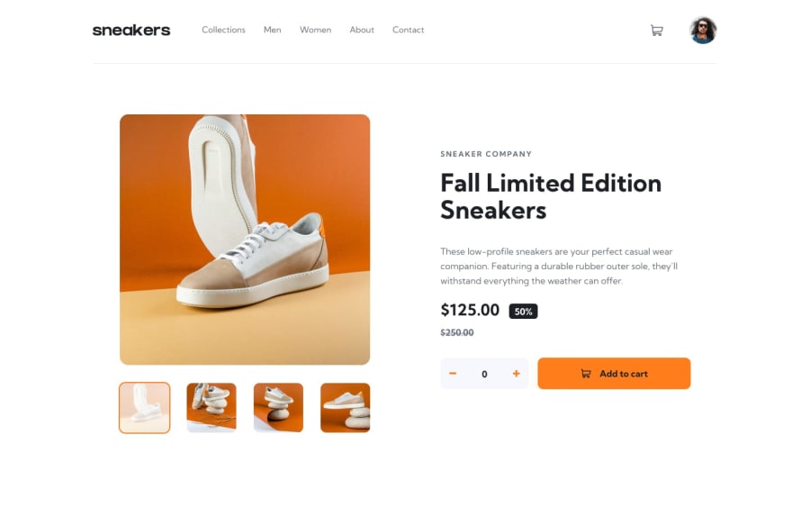
Design comparison
Solution retrospective
One of the most major learnings from this project is the carousel component with a thumbmail navigation, and the lightbox which is basicly just the carousel but with a modifier class turning it to a lightbox. To save carousel functionality after cloning one for lightbox implementation, it was decided to make a special carousel class.
The carousel is currently responsive, but does not have full accesability. The user cart also needs work. I just thought that my goal in this project has been achieved so far. I'm also not entirely happy with the carousel class. I feel like I could have accomplished the same thing in a more efficient way.
Community feedback
Please log in to post a comment
Log in with GitHubJoin our Discord community
Join thousands of Frontend Mentor community members taking the challenges, sharing resources, helping each other, and chatting about all things front-end!
Join our Discord
