Design comparison
SolutionDesign
Solution retrospective
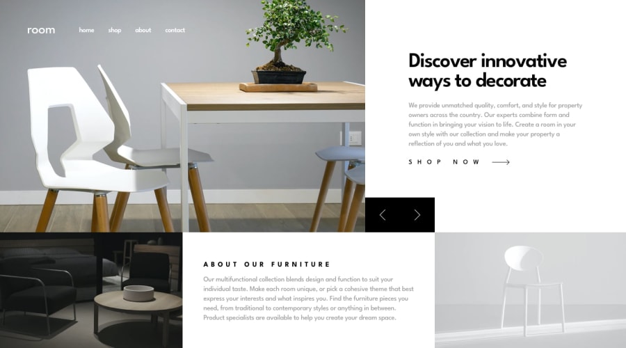
I decided to try going the vanilla route this time. For the hero slideshow, I set the div's background image and used JS to switch the image on button clicks.
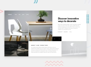
I've initially gone with grid-template-areas to set the grid layout, but I think that I'm going to switch to using flex an flex direction with two separate divs to display as needed based on media queries. I can't quite get the bottom row to fit exactly like the design with my current solution.
If anyone has any thoughts, tips, or tricks to make the layout more similar to the design I'd love to hear them.
Community feedback
Please log in to post a comment
Log in with GitHubJoin our Discord community
Join thousands of Frontend Mentor community members taking the challenges, sharing resources, helping each other, and chatting about all things front-end!
Join our Discord
