Hi to everyone reading my post and probably checking my creation !
For this one I had to learn a bit about Javascript. In fact, I started this challenge like 2 months ago, and I learned Javascript basics when I had free time not working.
My first mistake was to trying to handle everything with Javascript (because, you know, it seems so powerful and when you get a new tool you want to use it everywhere !). I ended editing the input fields styles and creating the elements containing error messages only by using JS, but I quickly understood it's not the best way to get this job done...
Finally, after having such a bad time for so long, I got motivated again and I could end this challenge being happy of my result :)
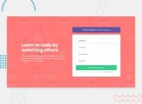
The only little thing that bothers me is this Try it free button...
I have 2 issues I couldn't resolve on it :
- First, I used flexbox to center the text but I had troubles with the spacing between my emphased text and my normal text. I have an
<em> inside an <a> element.
- Then when I worked on responsive, I noticed that using flexbox wasn't getting me a good result for 2-lines text. Maybe I should have played with flexbox-shrink property or something ? I ended up using padding to center it, but it becomes sadly ugly around 570px width...
Anyways, thanks if you took some time to read my comments, and I would fell very happy to get your comments and advices on the solution provided. :)
Peace !
Ozan


