

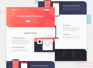
Design comparison
SolutionDesign

Solution retrospective
Hope to receive your suggestions so that I can improve.
Community feedback
- @Deevyn9Posted over 2 years ago
Hi Minh,
Great representation, However, i went through the project and code and found the following;
Try centering your various divs on the mobile view.
The footer height should also be reduced for desktop.
The margin values can be tweaked to make it look better.
And lastly using the specified fonts to give it an even better look.
Happy coding
The width of the dropdown menu should be tweaked, it also has two min-width instructions in the code.
0

Please log in to post a comment
Log in with GitHub
Join our Discord community
Join thousands of Frontend Mentor community members taking the challenges, sharing resources, helping each other, and chatting about all things front-end!
Join our Discord