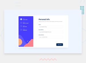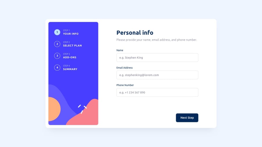
Design comparison
Solution retrospective
It was a pain to name things in this project. I consider myself decent with js, but this project was all about how to manage your code and html structure. but I thing i know what i need to do (practice a lot more Intermediate project for more experience)
Btw I appreciate all the feedback
Community feedback
- @visualdennissPosted over 1 year ago
Great job in completing the challenge successfully! Your solution looks great overall, the design implementation is simple neat. Both mobile and desktop view respond well to resizing. It also functions well.
One small detail that can be improved is that there is no need to have a input field with number increment options as this is not going to be used to enter phone numbers by the users and it might even be confusing for them.
If this was helpful, feel free to mark it as helpful! Good luck on upcoming projects!
1
Please log in to post a comment
Log in with GitHubJoin our Discord community
Join thousands of Frontend Mentor community members taking the challenges, sharing resources, helping each other, and chatting about all things front-end!
Join our Discord
