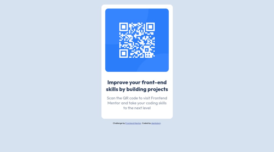
Design comparison
Solution retrospective
Hi! I'd really appreciate if you could take a look and give me feedbacks onwhat I could do better. I'm a complete newbie.
Community feedback
- @EmmanuelHexerPosted almost 3 years ago
Nice work man.
Marked as helpful1 - @abdoachhoubiPosted almost 3 years ago
Hi there! You've done a great job ❤️ Still needs some positioning to be perfect, but it's also fine the way it is!
Marked as helpful1@danilobmlPosted almost 3 years ago@abdoachhoubi Thanks a lot for checking it out! :) Would you mind expanding a bit about what I could do to position things better? I'd really appreciate that because this part is quite challenging for me.
1@abdoachhoubiPosted almost 3 years ago@danilobml Since you're working on a single card component, I suggest you to set the height of the body to 100vh and set it display to flex (direction column) and then set both align-items and justify-content to "center"
Marked as helpful1@danilobmlPosted almost 3 years ago@abdoachhoubi Thank you! I'll implement that!
1 - @andre-rostPosted almost 3 years ago
Good work Dan 🙌🏻
1
Please log in to post a comment
Log in with GitHubJoin our Discord community
Join thousands of Frontend Mentor community members taking the challenges, sharing resources, helping each other, and chatting about all things front-end!
Join our Discord
