Submitted over 1 year ago
Responsive using flex box, bootstrap for responsive navbar
@raahim21
Design comparison
SolutionDesign
Solution retrospective
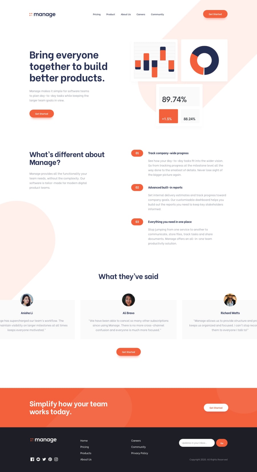
The carousel was the most hardest part, I misunderstood the overflow property. I added overflow hidden to the body tag which conflicted with the carousel container, furthermore the background image is pretty hard to position. if one is familiar won how to position an image please feel free to comment.
Lastly after a lot of practice I finally understand that making a layout before adding any text is the best practice, use background colors like #ccc and dark gray for layout creation
Community feedback
Please log in to post a comment
Log in with GitHubJoin our Discord community
Join thousands of Frontend Mentor community members taking the challenges, sharing resources, helping each other, and chatting about all things front-end!
Join our Discord
