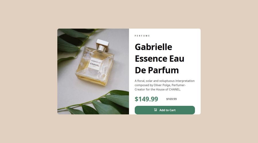
Design comparison
SolutionDesign
Community feedback
- @ysagohhPosted 18 days ago
Hello, your solution looks good! I'm also learning from your semantic HTML and the comments you put in your CSS.
For the design, you may want to use the fonts provided in the style guide so your site looks closer to the design. 🙂 You could also increase the width when your design switches to the mobile version, so the text doesn't shrink too small before it adapts to mobile. Keep it up! 👏
0
Please log in to post a comment
Log in with GitHubJoin our Discord community
Join thousands of Frontend Mentor community members taking the challenges, sharing resources, helping each other, and chatting about all things front-end!
Join our Discord
