

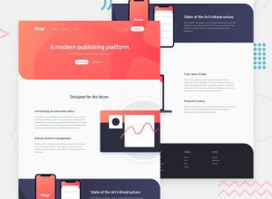
Design comparison

Solution retrospective
- Man oh man did I struggle with this challenge. This is the second landing page I have built and I had a lot of trouble making things responsive. This is also the first time I had to implement drop-down menu so I had to look everywhere for example to follow.
- Does everything look good to you? What would you do differently if you were me? Really hope to hear everyone 's feedback, thanks in advance. <3
Community feedback
- @MinhKhangTranPosted over 2 years ago
Hi Badt, your solution is very nice I like it.
I just found a small "issue". I just discovered it because I played with the viewport. If you go to mobile viewport and click on the hamburger the navigation opens. This is the expected behavior. But if I change the viewport to desktop the navigation should switch to the desktop Navigation. But your solution still shows the mobile navigation.
With a small code like this you can prevent this:
  // Check if responsive menu is open when resized and then remove
  window.addEventListener("resize", () => {
    if (
      navBar.classList.contains("mobile-show") &&
      window.matchMedia("(min-width: 768px)").matches
    ) {
      headerNav.classList.remove("mobile-show");
    }
  });
This is a very small issue and normal user normally would not resize the viewport like developers.
Keep Going. The struggle was totally worth it. It is a nice solution 🥰
Marked as helpful1@saodinhPosted over 2 years ago@MinhKhangTran Thank you, I didn't test that case and now i am going to fix it. Your feedback is really helpful and it gives me more motivation to continue. By the way, I notice your name is a Vietnamese one, so "Cảm ơn nhìu"
0

Please log in to post a comment
Log in with GitHub
Join our Discord community
Join thousands of Frontend Mentor community members taking the challenges, sharing resources, helping each other, and chatting about all things front-end!
Join our Discord