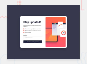
Design comparison
Solution retrospective
The most challenging thing I found about the project was adjusting the picture to look exactly like in the design. I tried margin and width adjustment, but something about it looked off. It did not come close to the design. Also with my error message, when the background shows up to show the invalid, the text becomes less visible to the extent that nothing is seen. I tried adjusting it but it did not work unfortunately.
I am a beginner and I doubt all my code, I hope that feeling will go away. My main fear is that I make a company code and it has errors. That is scary.
My question is how to adjust the pictures and how to make the text visible when the form shows invalid color background.
Community feedback
Please log in to post a comment
Log in with GitHubJoin our Discord community
Join thousands of Frontend Mentor community members taking the challenges, sharing resources, helping each other, and chatting about all things front-end!
Join our Discord
