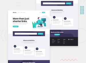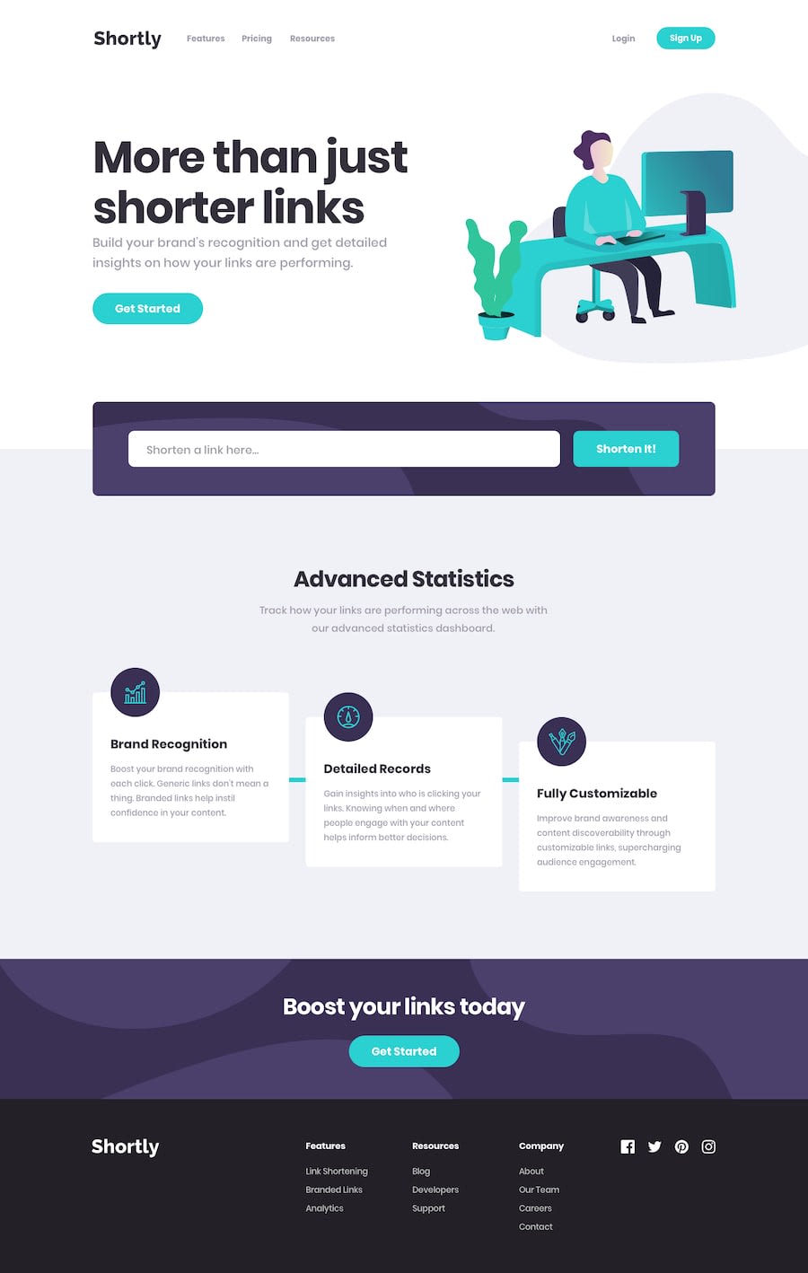
Responsive URL shortening website using ReactJS and SCSS
Design comparison
Solution retrospective
I'd really love a feedback. I challenged myself to do this with ReactJs. Let me know if you think I delivered this properly. Is there something you feel I should have done differently?
Community feedback
- @carlwickerPosted almost 3 years ago
Great job, there are however a few other issues I would consider fixing.
- The input field validation doesn't always work, it should revalidate on every change.
- And submit on Enter key press for the input field would help accessibility.
- on clicking the submit button with incorrect data the input breaks and is no longer usable.
Finally fix those accessibility and HTML issues in the report.
Layout look good, great work.
Marked as helpful1@phaevourkhrisPosted almost 3 years ago@carlwicker Thanks a lot for the feedback
0@phaevourkhrisPosted almost 3 years ago@carlwicker you can check again to see if the things you suggested have been corrected. Thank you.
0@carlwickerPosted almost 3 years ago@phaevourkhris I think the input validation is still not quite right, check how my solution works, I believe this is how the validation input styling is meant to be implemented.
https://react-shortly-url-shortening-api.vercel.app
0 - @skyv26Posted almost 3 years ago
Hi! Favour, you made it really nice and you did it using Reactjs (Iceing on the cake).
Suggestion
-
For each navigation menu give idea of each section of this challenge to each menu anchor' tag href. So that if someone click on menu then that particular menu takes user to that particular section.
-
Your social media icon at the bottom is not aligned properly to center. So make it center.
Overall 7/10 Good Job 👍
Marked as helpful1 -
- @phaevourkhrisPosted almost 3 years ago
Hi @skyv26 thanks for the feedback, but I don't quite follow.
There's barely any sections relating to the menu buttons in the nav bar, that is why they weren't linked. Seeing as we only worked on the landing page. I assumed that those menus will link to other pages.
Also, From the design, I don't quite see the social media icons aligned to the center for the desktop screen. Except you're referring to a smaller screen size. So if you'd please make me understand what you mean better, I'd appreciate that.
Thank you
0@skyv26Posted almost 3 years agoHey! @phaevourkhris, I understand and I agree with your first point about nav menu. It is ok .
But i am not agree with 2nd point as you said except smaller sizes screen ?
Listen, as you know very well (from your design I can say you are intermediate developer may be doing job somewhere) that User experience matters alot. Suppose if you made a design but in your audience 40% people have smaller screen mobile phone then you left only with 60% audience according to 80/20 rule, then your design will only reach to 12% people.
I hope you understand and like my fact too.
My curiosity (For styling what you have used like styled component, normal css or modular css or other.)
Good Luck 🤞
0@phaevourkhrisPosted almost 3 years ago@skyv26 Thanks again.
I kinda get what you're saying, I was only enquiring if the centering you referred to was for smaller screens. So I know where to fix the issue from.
For styling I used SCSS. I'm still sort of new to it though.
Goodluck!
1
Please log in to post a comment
Log in with GitHubJoin our Discord community
Join thousands of Frontend Mentor community members taking the challenges, sharing resources, helping each other, and chatting about all things front-end!
Join our Discord
