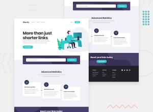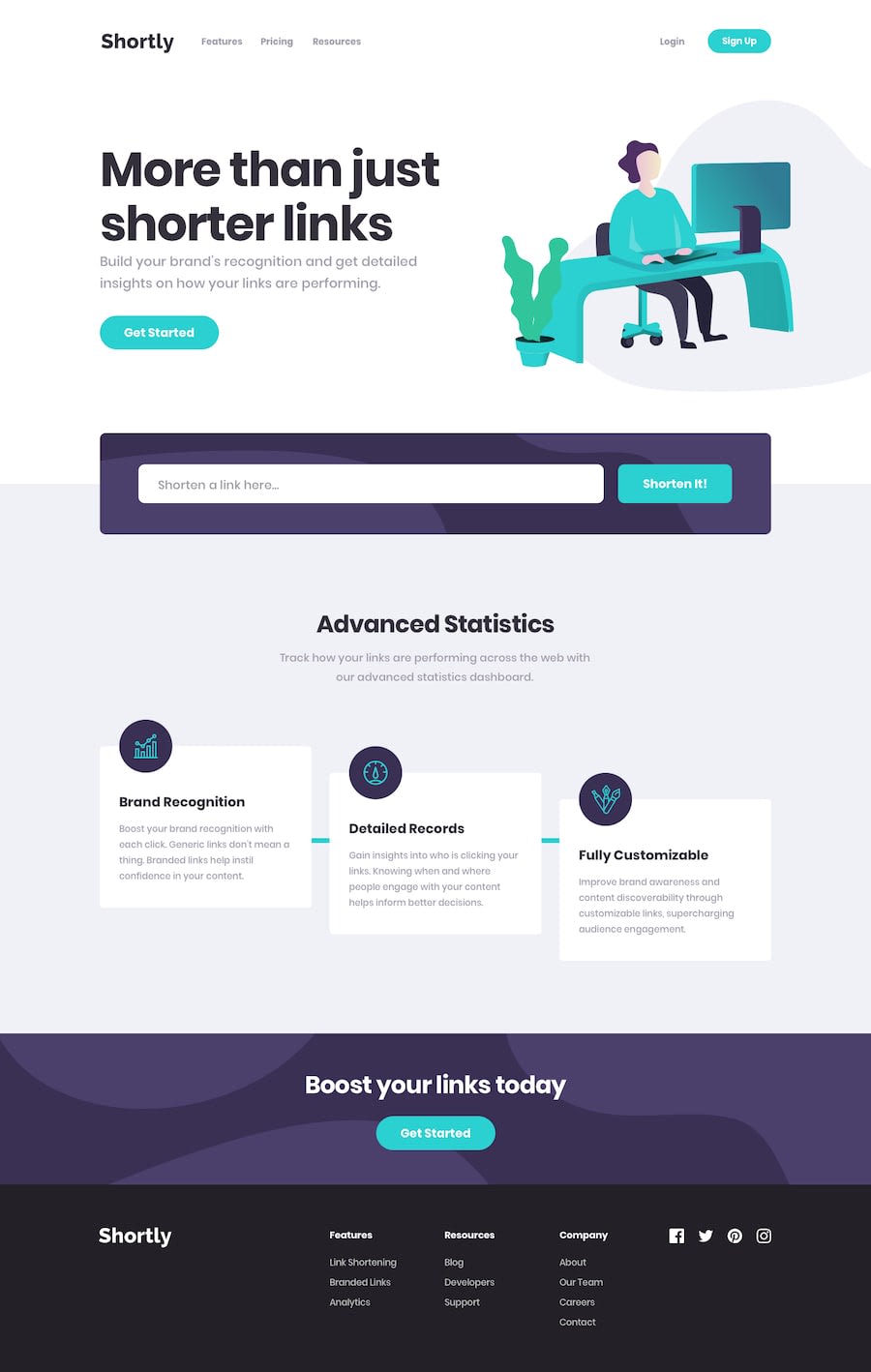
Design comparison
Solution retrospective
Added a link clearing button, localstorage, and some other cool features to go above and beyond -- take a look!
I'm open to any feedback, but looking for ways to make my javascript more concise. Any recommendations? Maybe something I could improve on in the planning stages?
Thanks for looking!
Community feedback
- @hmadamkPosted about 2 years ago
- Well done, acouple of notes for accessibility
- links must have describtive text for links with icons use aria-label to describe your link to non-sighted users and screen readers like so
<a href="#" aria-label="Our facebook page">- make sure that all of your page is contained by a landmark examples of landmarks are
header for the top section
main for your main section
section with aria-label to describe why you added this section
footer for the bottom section
Marked as helpful1@CallMe-ALPosted about 2 years ago@hmadamk Thank you!! I always forget to add such things, I need to get in a better habit of that lol. I'll work on those changes shortly. Thanks again for looking and the feedback!
0@hmadamkPosted about 2 years ago@CallMe-AL Wow! you actually fixed them you rule, If you want any help related to javaScript, Css, Html sematic and accessibility please let me know I would be happy to help,
1@CallMe-ALPosted about 2 years ago@hmadamk Thank you hmadamk! I absolutely will. Looking forward to seeing what you create, too!
0
Please log in to post a comment
Log in with GitHubJoin our Discord community
Join thousands of Frontend Mentor community members taking the challenges, sharing resources, helping each other, and chatting about all things front-end!
Join our Discord
