Submitted over 3 years agoA solution to the URL shortening API landing page challenge
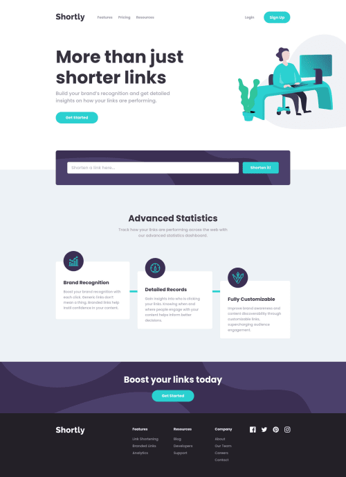
Responsive URL shortening page
chakra-ui, react, vite
@ezechuka

Solution retrospective
Any suggestions are welcome
Code
Loading...
Please log in to post a comment
Log in with GitHubCommunity feedback
No feedback yet. Be the first to give feedback on Chukwuka Eze's solution.
Join our Discord community
Join thousands of Frontend Mentor community members taking the challenges, sharing resources, helping each other, and chatting about all things front-end!
Join our Discord