

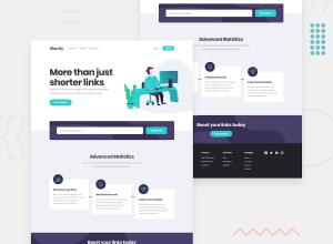
Design comparison
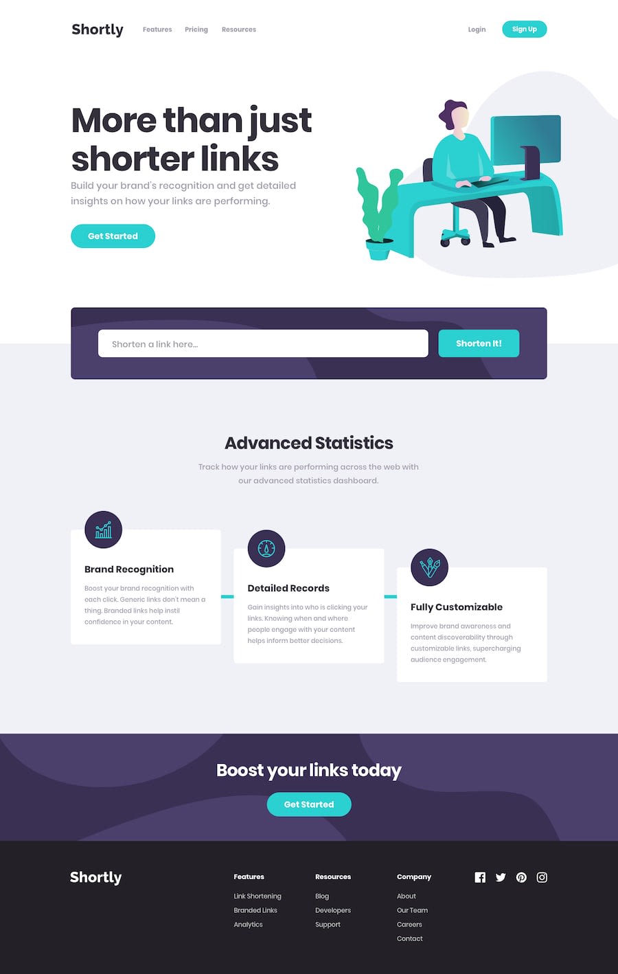
SolutionDesign
Solution retrospective
What specific areas of your project would you like help with?
Any feedback would be appreciated.
Community feedback
- @azzykesumaPosted 4 months ago
congratulations on finishing the project, well done!, maybe i can try giving some comments that may help you in the next project
- try mobile first approach when implementing fm challenge , meaning that instead of using
max-widthfor a baseline for responsive, try usingmin-width, that way you can structure your code better, as you have a mental image for various breakpoints like@media screen and (min-width: 768px)is designed for tablet screen and above, whereas below it, it targets the mobile screen. using tailwind will make this whole process easier ,as you just need to specify the base class and the breakpoints example<div className='flex flex-col md:flex-row'>...</div>will make your div has a flex col on mobile to tablet, and row on desktop. - i think you need to check this block of code
        window.addEventListener('resize', () => {
            if(window.innerWidth <= 376) {
                setIsMobile(true);
            } else {
                setIsMobile(false);
            }
        })
    });

    useEffect(() => {
        if(isMobile) {
            if(menuActive) {
                ref.current.style.display = 'flex';
            } else {
                ref.current.style.display = 'none';
            }
        } else {
            ref.current.style.display = 'flex';
        }
    }, [menuActive]);
this code make it so that, when i first resize the screen to mobile size, it automatically open the navs. i think instead of dynamically display or hide the mobile navs, instead you can modify the button to open and close the mobile menu. that way, you don't have to check whether the menu is active or not.
keep on coding!
Marked as helpful0 - try mobile first approach when implementing fm challenge , meaning that instead of using

Please log in to post a comment
Log in with GitHub
Join our Discord community
Join thousands of Frontend Mentor community members taking the challenges, sharing resources, helping each other, and chatting about all things front-end!
Join our Discord