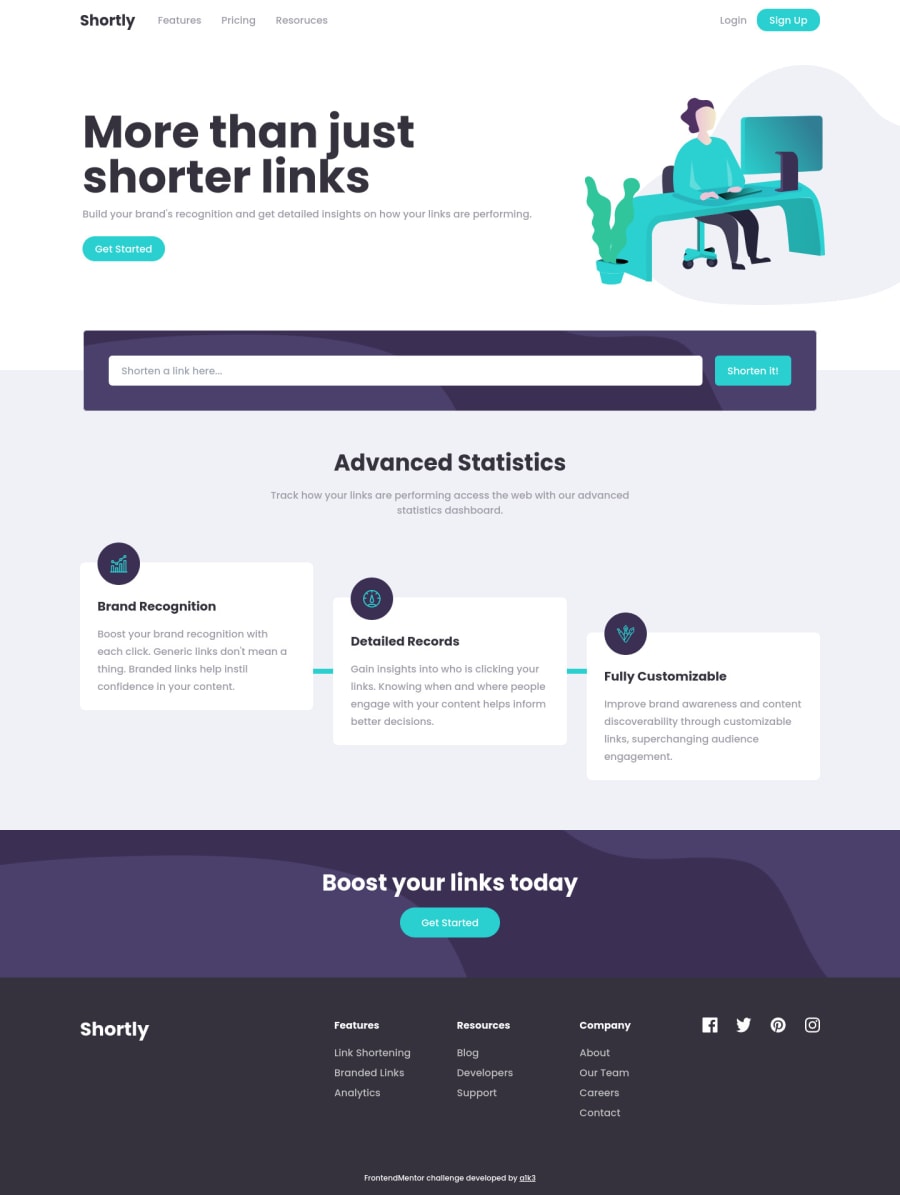
Responsive URL shortener App (Landing Page) - React Tailwind
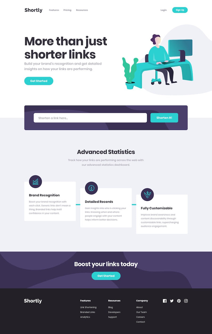
Design comparison
Solution retrospective
Any suggestions or improvements are welcome!
Community feedback
- @dwhensonPosted about 3 years ago
Hey @AikeNyanLynnOo - Lovely job here 🙌 - great job in handling the API and the various error messages, I found this really tricky 👍
One thing I would suggest is trying to use some more semantic HTML. I don't know any React, but it would be good to use the
header,mainandfooterelements as this will help people navigating the site using assistive tech. I would also suggest putting the trash can image inside a button to make that keyboard focusable too.You might like to also consider adding some outline styles? I have found the advice in this article very useful: https://css-tricks.com/the-focus-visible-trick/
I use the code below from it in pretty much all my projects and it does the job 95% of the time - sometimes you need to chance the currentColor setting.
/* Add styled focus states on tab not hover */

:focus-visible {
  outline: 3px dotted currentColor;
  outline-offset: 0.25rem;
}

:focus:not(:focus-visible) {
  outline: transparent;
}
Lovely job though! I really like what you did here!
Cheers 👋
Dave
Marked as helpful0@AikeNyanLynnOoPosted about 3 years ago@dwhenson Thanks for your kind feedback I will fix 🤓
1
Please log in to post a comment
Log in with GitHubJoin our Discord community
Join thousands of Frontend Mentor community members taking the challenges, sharing resources, helping each other, and chatting about all things front-end!
Join our Discord
