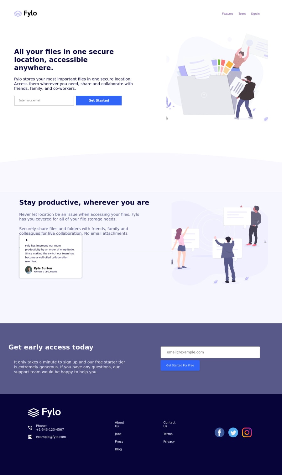
Responsive Two Column layout using Flexbox & Media Query
Design comparison
Solution retrospective
This was very fun and challenging to do. The only issue I got is the desktop layout was very much different than mobile one, means the content grouping was different. It was not like that we just type flex direction: row in desktop and our work is done. I had to use reverse direction in multiple cases. Even had to create some extra classes so as to group them according to the desktop layout. If it can be done more easily then please suggest. I am keen to learn if it can be done more efficiently. Any other suggestion are also welcome.
Community feedback
- @afrusselPosted over 3 years ago
There are lot of issue in your output.
- Add a :hover in nav
- Stay productive section is cutting off and below box is inside this section
0@imparassharmaPosted over 3 years ago@afrussel I don't know what is wrong with it. I am checking it on my end and it seems ok. Checked for 1440 resolution also.
0
Please log in to post a comment
Log in with GitHubJoin our Discord community
Join thousands of Frontend Mentor community members taking the challenges, sharing resources, helping each other, and chatting about all things front-end!
Join our Discord
