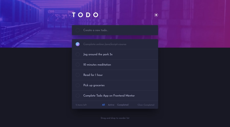
Design comparison
Solution retrospective
In the realization of this project it was a bit difficult for me to position its components, but with a little patience I always manage it, I think that several things can be deleted from the css. Any suggestions on where to put the styles? Is it better in the css of the parent component or is it better in the css of the component?
Community feedback
- @nelsonleonePosted almost 2 years ago
Congrats on completing the challenge ,
Am just writing based on your question , how you sort and arrange your files is your choice, there's no rule for that.
But you need to make sure it would be easy for someone else to navigate through your files and understand how you did stuff
0
Please log in to post a comment
Log in with GitHubJoin our Discord community
Join thousands of Frontend Mentor community members taking the challenges, sharing resources, helping each other, and chatting about all things front-end!
Join our Discord
