Design comparison
SolutionDesign
Solution retrospective
Bugs with Images in Mobile version
Community feedback
- @abhik-bPosted almost 4 years ago
Hi Fernando, You have done a amazing job on this challenge.👌
I really liked it
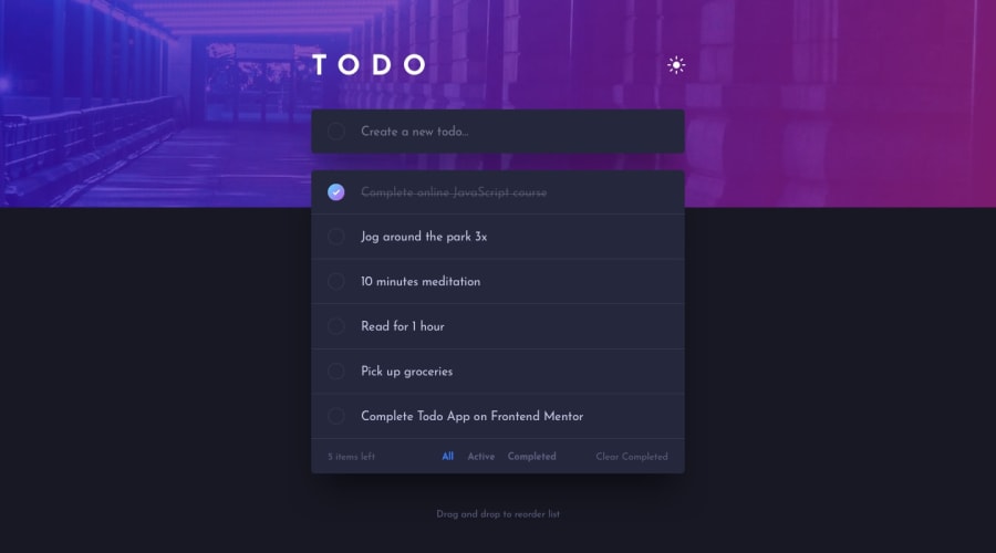
- check transition is nice
- input placeholder transition is also nice (just a opinion give this text a very light color like 'clear-completed button')
- its very responsive ( not sure why you said images r buggy on mobile it just takes some time to change images )
- theme changing transition is also good enough
Keep it up 💯
0@inanocsPosted almost 4 years ago@abhik-b Thank you so much. I really appreciate your words 😀
0
Please log in to post a comment
Log in with GitHubJoin our Discord community
Join thousands of Frontend Mentor community members taking the challenges, sharing resources, helping each other, and chatting about all things front-end!
Join our Discord
