Design comparison
Solution retrospective
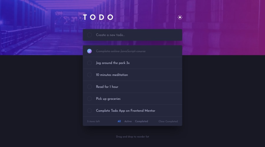
Making This Todo list app was very fun and interesting and I got to learn so many things in this challenge like the implementation of light and dark mode, DOM manipulation. etc it was a very informative and great learning experience and also this todo list app is very handy and has many useful options such as it shows how many todo items are added and how many are left the unfinished we can even see how many todos are unfinished, and how many are completed and we can also clear all the completed todos. all and all this app is very useful and pretty easy to use.
What challenges did you encounter, and how did you overcome them?I faced difficulties in implementing the light and dark mode as it was new to me and i had never tried to make a dark mode before also i had a bit of difficulty in adding the todo items and making the checkbox inside them exactly round shaped and make the check mark appear on it whenever it is clicked which I even solved after taking references from here and there.
Community feedback
Please log in to post a comment
Log in with GitHubJoin our Discord community
Join thousands of Frontend Mentor community members taking the challenges, sharing resources, helping each other, and chatting about all things front-end!
Join our Discord
