Submitted about 1 year ago
responsive todo content by adding max-widht to it
@iskandar13abdurakhmonov
Design comparison
SolutionDesign
Community feedback
- @reka723Posted about 1 year ago
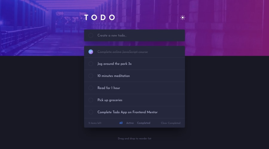
I think you have done a great job regarding the business logic of this challenge. It is well styled, the dark mode is working just fine. I would like to point out some details you could pay more attention to in the future:
- If you enter a long todo task, the X messes with the width of the list
- the bottom panel (n items last, filters, clear completed) is very cramped, you could use gap/padding/margin on those
- the "n items left" font size is way to small -I think the filtering (all/active/completed) is not working properly, it only rearranges your list, but its not a bad solution.
Overall, this is a great solution, keep up the good work!! :)
Marked as helpful1@iskandar13abdurakhmonovPosted about 1 year agoThank you for taking a little time to check out the app, for the next submission I will try to correct all the shortcomings that you have listed @reka723
0
Please log in to post a comment
Log in with GitHubJoin our Discord community
Join thousands of Frontend Mentor community members taking the challenges, sharing resources, helping each other, and chatting about all things front-end!
Join our Discord
