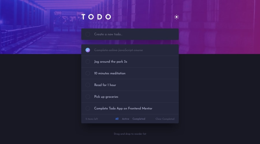
Design comparison
Solution retrospective
🔧 Tech Stack: React.js, Typescript, Tailwind CSS, ViteJS.
🌐Key Takeaways: I successfully implemented dark mode using Tailwind CSS, and also was able to deepen my understanding of props, useState, and useEffect in the process of creating this app.
🐛 While this project presented numerous challenges and bugs, I view them as invaluable learning opportunities. They have contributed to my growth as a developer and honed my problem-solving skills.
Community feedback
- @RodrigoHLCPosted 11 months ago
Looks very good man, and the responsiveness works great! I did find one issue though that pretty much breaks the app: if all your tasks are unchecked, and you click on "Completed", the bottom selection bar disappears and it's impossible for the user to see the list again. (Same thing if all tasks are checked and you click on "Active", though at least in this case you can add a new task and that will make the bottom bar popup again).
Marked as helpful0@devhnryPosted 11 months ago@RodrigoHLC Oh Wow, Just Noticed It Thanks a lot, Will look into it Asap
1
Please log in to post a comment
Log in with GitHubJoin our Discord community
Join thousands of Frontend Mentor community members taking the challenges, sharing resources, helping each other, and chatting about all things front-end!
Join our Discord
