Design comparison
Solution retrospective
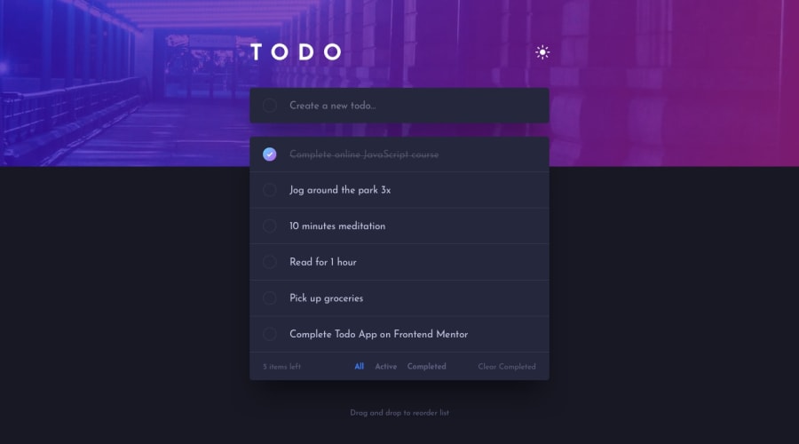
I did most of the functions except drag and drop using React and Scss. Any Feedback would be nice
Community feedback
- @XMadFoXPosted about 2 years ago
Hello!
Here are some tips: Add invisible label for first (create todo) input. This is needed because not all screen readers can read placeholder text. Make this input field wider (fill space until add button). Buttons should always have type attribute to avoid unexpected behavior.
Clicking on to-do text should toggle done status. You can archive this by linking
label&checkbox(either wrapinputwithlabelor uselabelwithforvalue same asidininput(should be unique for each item). Fix layout shift caused by appearingxon hover.If you'd like to implement DnD check out dnd kit
You may try to use some CSS framework, as you used naming like utility classes, you may like TailwindCSS.
0
Please log in to post a comment
Log in with GitHubJoin our Discord community
Join thousands of Frontend Mentor community members taking the challenges, sharing resources, helping each other, and chatting about all things front-end!
Join our Discord
