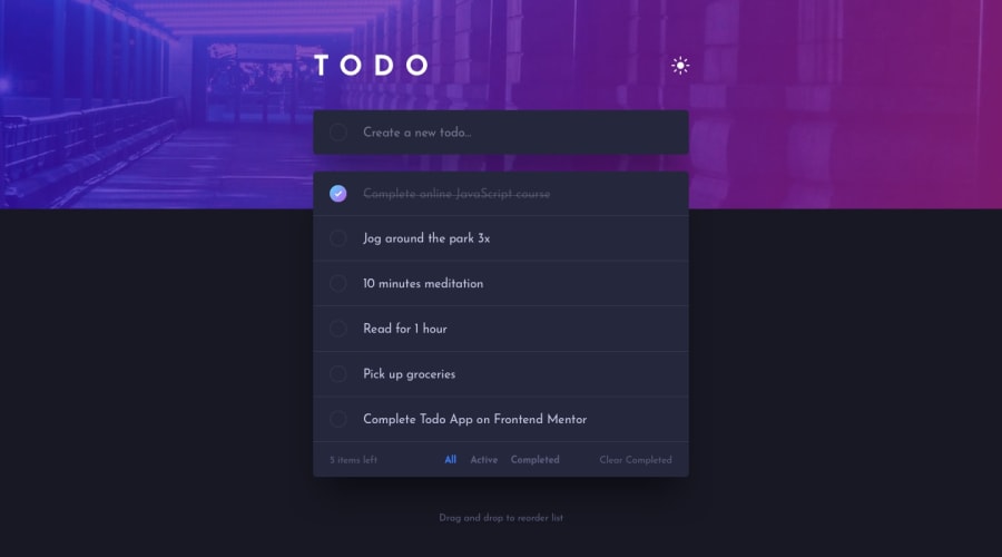
Responsive todo app using pure JS and the HTML5 Drag and Drop API
Design comparison
Solution retrospective
I've implemented the drag and drop functionality using the HTML5 Drag and Drop API, but it only works on Firefox (desktop). Any thoughts on the best ways to implement it? Thanks in advance!
Community feedback
- @pikapikamartPosted about 3 years ago
Hey, awesome work on this one. Both desktop and mobile layout looks really great. I tried the todo app and it works great as well.
Some suggestions would be:
- Well I tried as well the d&d api for this and it works I think for other browsers? I haven't tested that one though:>
- Using
buttonfor a theme-selection works but it could use a more appropriate markup. For this one or in general when you have a theme-selection, you need to use radio buttons since it is a selection and radio buttons are used for those. On this, 2 radio buttons with 2labelsthat are inside afieldsetalong with a screen-reader onlylegendthat will describe the purpose of those radio buttons. Have a look at my solution for this one, inspect the markup for the theme-selection. If you have queries about, just let me know okay^^. - Add a
typefor aninputtag. - It would be great to have an
aria-liveelement that will announce when a todo-item has been added or when a todo-item has been removed by the user. This way, toggling those buttons will inform the users right away on what happenned. - Inside the
.tasksselector, a single heading with "list of task items" is enough and not multiple sr-only heading tags. - Also, it shouldn't be a
buttonon the todo-item check, it should beinput type="checkbox"and the todo-container or todo-name should be thelabelfor theinput. - The delete
buttonshould have an extra text inside it, on what todo-item will it remove. For example:
button = remove eat ice cream todo item
button = remove watch walking dead todo item
This way, users won't get the same text of
delete task. They will be confused on what todo-item will it remove since that is the only text that it will state.- No need to use
ptag to wrap theclear completedbutton, just simply usebuttonfor it. - For this one, you could use a single
aria-liveelement or two, to announce those different event that happens since there will be a lot on this app. Todo item creation, todo-item completing, removing, selecting tab, removing all completed.
Again, really great job for this one and great that you are focusing on accessibility.
Marked as helpful0@willykleitinhoPosted about 3 years ago@pikamart Thanks for the feedback, Ray! I really appreciate you taking the time to review my code. I'll make these changes you suggested as soon as I can!
1
Please log in to post a comment
Log in with GitHubJoin our Discord community
Join thousands of Frontend Mentor community members taking the challenges, sharing resources, helping each other, and chatting about all things front-end!
Join our Discord
