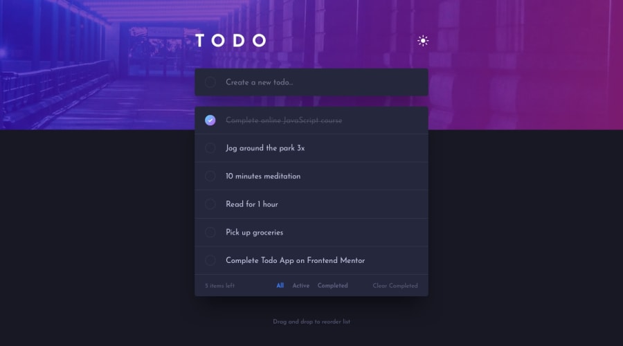
Design comparison
SolutionDesign
Solution retrospective
My second project using React went well. Any feedback is greatly appreciated :)
Community feedback
- @ayushknathPosted over 1 year ago
It's great. Just one suggestion from my end would be to keep the image fixed as the list grows. Currently, the image grows as the list gets bigger. You can have a look at how I have approached the challenge and get some insight from that.
Marked as helpful0@hnasser44Posted over 1 year agoThank you pointing it out. Initially, I was using percentages for the background image, but I have now changed it to pixels.
0@ayushknathPosted over 1 year agoYes, now it looks good. Also, try to implement
localStoragefunctionality to store the list items and theme preference.0
Please log in to post a comment
Log in with GitHubJoin our Discord community
Join thousands of Frontend Mentor community members taking the challenges, sharing resources, helping each other, and chatting about all things front-end!
Join our Discord
