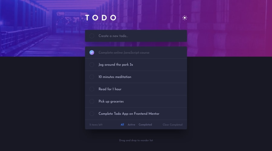
Responsive To Do List available in both light and dark modes
Design comparison
Solution retrospective
I haven't done the drag and drop yet, which at the moment seems pretty hard actually. Can anyone recommend a tutorial on its implementation without using ready libraries for that ?
Community feedback
- @Arnob-007Posted almost 4 years ago
Hey Seymur, your solution looks really great.
For further improvement, you can add scrolling feature to handle long list of To-dos. Also, I see the input field goes out of screen when the width is too small (like galaxy fold devices).
I don't know if external link sharing is supported or not. You can simply search drag and drop and get good tutorials on this from YouTube.
The design was cool. All the best for your future projects. Happy Coding < 3
1 - @ApplePieGiraffePosted almost 4 years ago
Hey, Seymur! 👋
Nice job on this challenge! 👍 I like the different background images you added and the way the delete options float up into view when a todo is hovered over! 😎
I recommend taking a look at your solution report and trying to clear up a few of the errors that are there. Don't forget to make your form more accessible by labeling the form and input elements! 😉
Keep coding (and happy coding, too)! 😁
0
Please log in to post a comment
Log in with GitHubJoin our Discord community
Join thousands of Frontend Mentor community members taking the challenges, sharing resources, helping each other, and chatting about all things front-end!
Join our Discord
