


Design comparison
Solution retrospective
It was hard but fun to build, i have learnt a lot from this project. If you could give me ideas on how best i can do this i would really appreciate it. Thanks
Community feedback
- @AmirNBKPosted about 1 year ago
Hey there nice job for developing this to-do list and it was great just some points that I wanna share with you: make this possible that when the user types the task and wanna add it, she/he be able to add it by the enter keyboard button because it is what most users do change the font color of the task the user types from black to white make the background image full width I think with this points your website gets even much better I hope this comment was helpful
Marked as helpful1@RedMwpPosted about 1 year ago@AmirNBK thank you very much for the insight, i never paid attention to those details, thanks again
1@AmirNBKPosted about 1 year ago@RedMwp that's my pleasure if it was helpful i'd be glad if you mark my comment as helpful
0 - @KrishnaVishwakarma1595Posted about 1 year ago
Hi, @RedMwp
I've a few points for you so can improve this and your upcoming solutions.
- You can comment/remove on the below CSS on your
.containerclass, as it is of no use. Cause you already give thewidth:100%, your background image will take the full width.
max-width: 1440px; margin: 0 auto;-
In the input field when we focus there is an outline around the input which makes the input look a bit odd, you can provide
outline: none. -
As there are no labels for the input you can provide the
aria-labelattribute to the inputs to pass the HTML Accessibility rules. We should either uselabeltag if there are labels defined for the input or provide anaria-labelattribute. For the plus icon input you can havearia-label="". We must follow the HTML accessibility rules, it'll be helpful for screen readers. -
On the task's list bottom part, where we have action buttons kind of text. There doesn't seem like a button at first until the user clicks it. Even they don't have the
cursor: pointer. Instead of using<li>or<p>tag for them, you should use either a<a>tag or a<button>tag. Having thecursor:pointer, gives the idea to the user that it is clickable thing which will do some action. -
Also, on click of these bottom actions it makes their colour change, which feels like a link visited. After the color change they also not look nice as they are already on top of dark background color.
-
There is an issue with clicking of the plus icon on the input container, even if the input is empty, if we click it adds an empty task on the list. Instead, you can check the input and show an appropriate error message like "Please fill the task first" or "The field is required"
-
It is nice to know that you used the browser's local storage to keep the user's tasks. But, when we click on
Clear completedit sometimes does not clear all the completed tasks. -
When there is no task in the task list container, there is a default scroll, cause you've used
overflow-y: scrollInstead, you can useoverflow-y: autoso that the container will have the verticle scroll only when there are a lot of tasks in the list.
Some Ideas
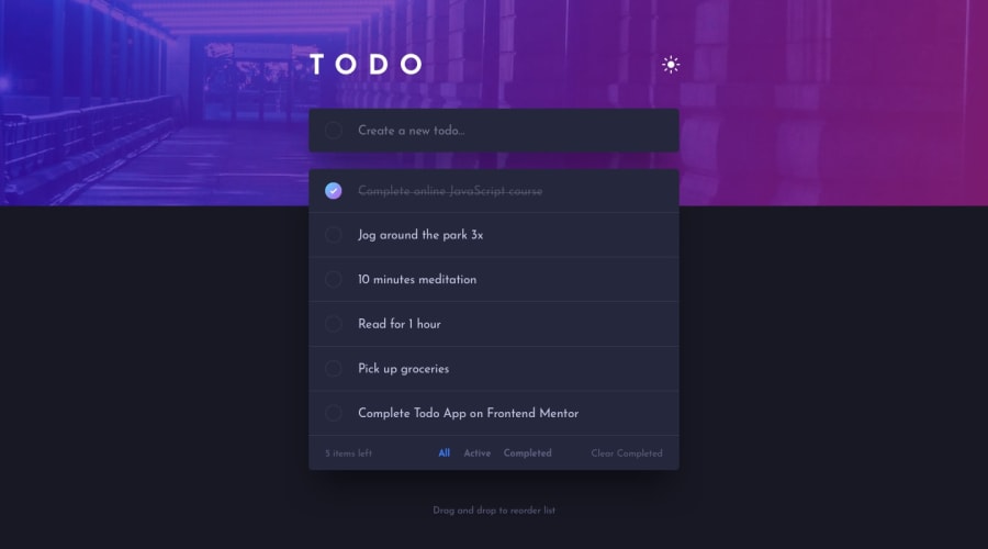
- As I can see there is a Sun kind of icon on the header, so by using this you can create your solution a theme based so on click it'll switch the theme from dark to light or vice versa. And you can use different styles/icons to show the active theme.
- You can have a drag-and-drop list so user can set the list by their priority tasks. You can use HTML5 Drag-and-Drop API or any other library for that.
- You can provide one more button/link to select all the tasks at once. So, users don't need to select each if they want to clear them.
I hope these points will help you and make your upcoming solution more great.
Happy Coding
Marked as helpful0@RedMwpPosted about 1 year ago@KrishnaVishwakarma1595 thank you very very much for your taking time to highlight the things which i missed and which i actually never thought of, i will edit the code and will correct all the things you highlighted beginning with the error message when the input is empty... thank you very much for your advise and correction.
1@KrishnaVishwakarma1595Posted about 1 year agoHi, @RedMwp Good to know it helped you. Keep mentoring! :)
1 - You can comment/remove on the below CSS on your
- @NatureSon22Posted about 1 year ago
First and foremost, congratulations on completing this project! It comes with an additional challenge, namely making the to-do items draggable to sort the list dynamically. If you're interested, you can take a look at my approach to implementing this feature using the HTML5 Drag-and-Drop API, which is a part of the HTML5 specification.
1


Please log in to post a comment
Log in with GitHubJoin our Discord community
Join thousands of Frontend Mentor community members taking the challenges, sharing resources, helping each other, and chatting about all things front-end!
Join our Discord