


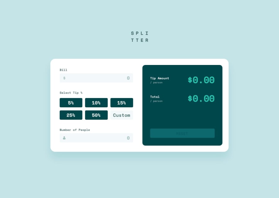
Design comparison
SolutionDesign
Solution retrospective
What are you most proud of, and what would you do differently next time?
State management is more complex here, I feel proud to have found a functional solution. Maybe I need to give it more thought, but it is optimal as far as I can go
What challenges did you encounter, and how did you overcome them?The default states in the inputs gave problems at the beginning, and the management became tedious
Community feedback
- @gmagnenatPosted 4 months ago
Hi, congrats on completing the challenge ! It looks great.
I can suggest a few things to improve the user experience specially for keyboard only users.
- You used divs and buttons for the tip options. When I select an option and press tab, I have to tab on all options again. It would be great to go straight to the next input. By using radio buttons instead you can have this by default... a bit more tricky to style.
- You can add validation for the other inputs. If no amount is entered. If a tip isn't selected.
- You can use the <output> element to have the calculated value announced to screen readers when updated. Or use an aria-live element where you announce the calculated values.
- I see that some text are set in pixels. Some user increase the system font size. using pixel will give them a bad experience as these elements cannot scale with user preferences.
I hope you'll find something useful in these comments to improve your solution even more.
Happy coding 🎉 !
0

Please log in to post a comment
Log in with GitHubJoin our Discord community
Join thousands of Frontend Mentor community members taking the challenges, sharing resources, helping each other, and chatting about all things front-end!
Join our Discord