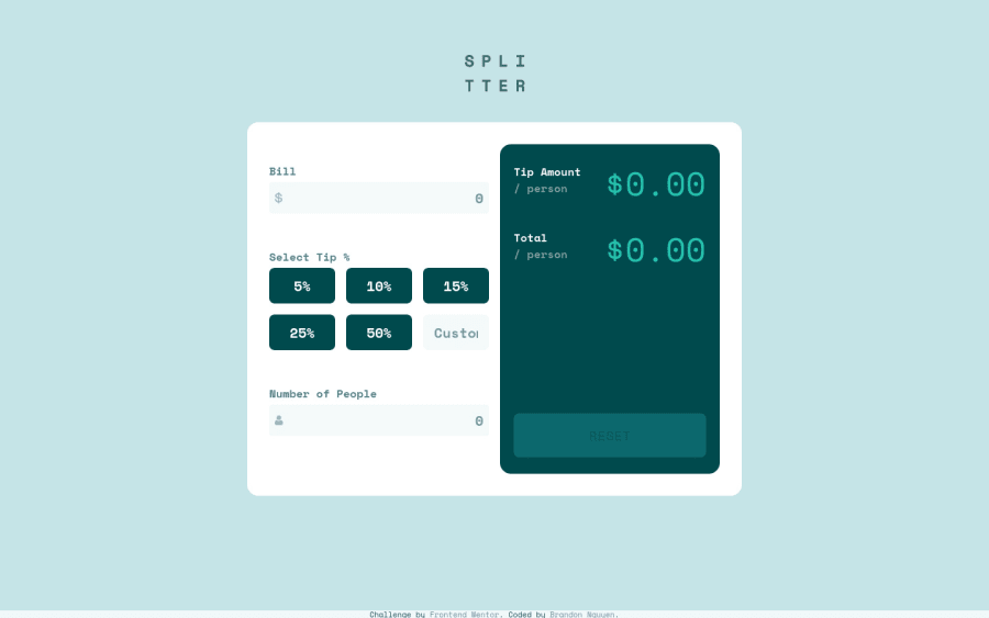
Responsive Tip Calculator Website using CSS Grid and Flexbox
Design comparison
Solution retrospective
Hi all!
This project was my first time using CSS Grid and Flexbox so extensively to create a desktop and mobile interface. I wanted to know if there were any glaring mistakes when I was using Grid or Flexbox. Or any practices I could use to better my usage of Grid and Flexbox.
Additionally, I know that I grossly misused git in this project. I know that you are supposed to make branches and then merge to master. Could anyone link me to a proper git workflow to follow?
Finally, please let me know if there are any best practices that I could've implemented in this project. I will happily implement any suggestions into my next projects.
Thanks in advance! Any help or advice is greatly appreciated!
Community feedback
Please log in to post a comment
Log in with GitHubJoin our Discord community
Join thousands of Frontend Mentor community members taking the challenges, sharing resources, helping each other, and chatting about all things front-end!
Join our Discord
