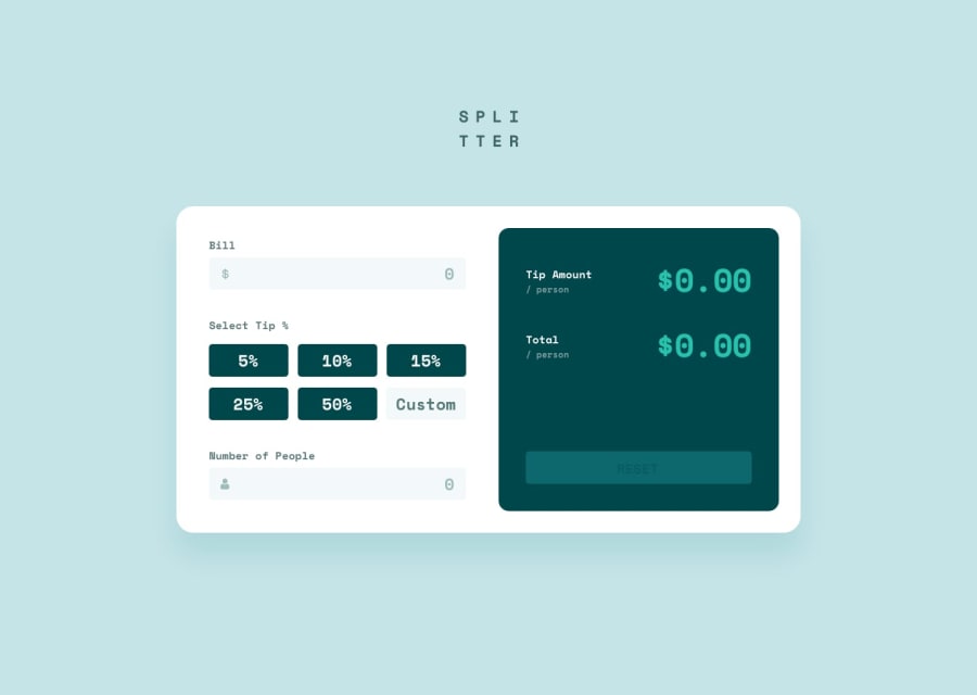
Design comparison
SolutionDesign
Solution retrospective
please give your suggestion
Community feedback
- @WandolePosted over 1 year ago
Hey,
the design of your solution is very good IMO!
The ways you could slightly improve it:
- when I click the main input to write a bill amount or the nbr of people, there is a shift of about 1mm of all your design. I didn't look into you CSS, but I suspect that it comes from a border that you add around the input. Try to use an outline instead of a border.
- for the tip amount when I hover the buttons (5%, 10%, etc.), the mouse cursor don't show me that I click the element (add the CSS propriety 'cursor: pointer')
For the logic of your app, you should improve it:
- The amount is calculated when I click on 'reset', I would like to see it before
- The values displayed are not good...
- I can't reset the form if there is a error in the form (if I let an input empty for example)
But overall, it's very good. Your design is close to the one you received!
0@kdrai007Posted over 1 year agothanks for your suggestion ..ya i will definitely implement it@Wandole
1
Please log in to post a comment
Log in with GitHubJoin our Discord community
Join thousands of Frontend Mentor community members taking the challenges, sharing resources, helping each other, and chatting about all things front-end!
Join our Discord
