
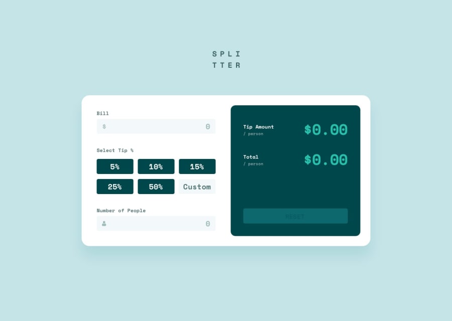
Responsive Tip calculator using plain CSS


Design comparison
Community feedback
- @arrejoriaPosted over 1 year ago
Hi Priyanshu Sharma, you have a nice design there, it's still in development or I might be wrong, but it looks great! 👏
I would like to help you with some tips or points that I noticed in your work.
Here are some recommendations :
1. [FORM]: I always think of something more semantic, I noticed you use divs to divide your form groups, you could try using
fieldsetto group related elements in a form. It is very useful for large shapes.You can also enhance your form for small devices by using the
forlabelattribute with aninputidto connect the element and provide a better experience for your users. 😁<tag for="fname">Name:</tag><input type="text" id="fname" name="fname">2. [CSS]: As I said, I think it's still in preparation and it might be a problem for other resolutions to adapt its design
Try not to use
%for your content or containers, instead use the height and width of the viewport. Explore further usingmargin or paddingto get the result you want.Useful CSS units:
max-widthandmax-heightor units likevwandvh.I can't wait to see it finished!
Thanks for sharing and I hope some of the above was helpful to you!
Happy coding!! 🧉
Lucas,
0

Please log in to post a comment
Log in with GitHub
Join our Discord community
Join thousands of Frontend Mentor community members taking the challenges, sharing resources, helping each other, and chatting about all things front-end!
Join our Discord