
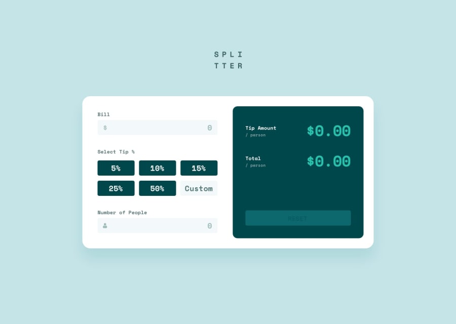
Responsive tip calculator using flexbox, grid, bem, scss and js.


Design comparison
Community feedback
- @5hraddhaPosted almost 3 years ago
Hey @rosberg03, I want to appreciate you for completing the challenge and the beautifully written code that is so easy to go over and understand. I loved the structure of the files and even though you have written the code. Great job!!
There are just two things I would like to suggest:
-
You have done a nice trick in splitting the page heading into two lines. But, I was wondering that separating the word 'SPLITTER' by a space would force the screen reader to read the word as two separate words like - SPLI TTER. That is not a good idea. I believe that if we can keep the word as one, and use <span> tag to break it into two lines, it would be great. As screen readers, just don't take any meaning out of <span>. So, it is better to make use of it for styling purposes.
-
Also, in most of the part you have implemented BEM methodology in a crisp manner but at two places, two elements of different blocks are nested within each other. If somehow we could avoid that, it would be even more clear and good to read and understand the BEM blocks and elements.
Great job!! ⭐ Thank you!!
Marked as helpful0 -

Please log in to post a comment
Log in with GitHub
Join our Discord community
Join thousands of Frontend Mentor community members taking the challenges, sharing resources, helping each other, and chatting about all things front-end!
Join our Discord