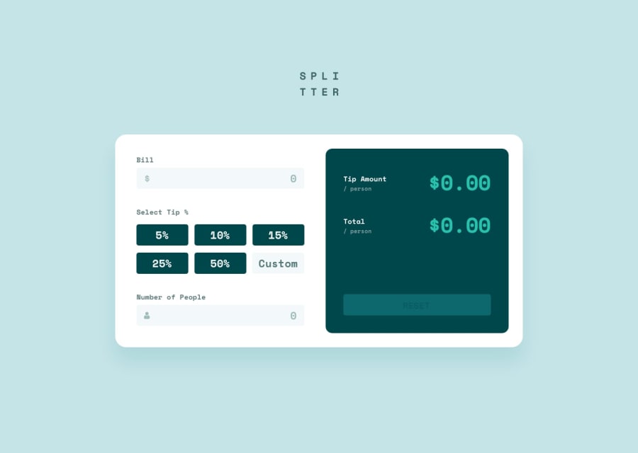
Not Found
Not Found
Not Found
Not Found
Not Found
Not Found
Not Found
Not Found
Not Found
Not Found
Not Found
Not Found
Not Found
Not Found
Not Found
Not Found
Not Found
Not Found
Not Found
Not Found

Submitted

responsive-tip-calculator

P

@prem-kumart

Desktop design screenshot for the Tip calculator app coding challenge

This is a solution for...

  • HTML
  • CSS
  • JS
2junior
View challenge

Design comparison


SolutionDesign

Solution retrospective


What are you most proud of, and what would you do differently next time?

  • Was able to work out the event loop of the whole app.

What challenges did you encounter, and how did you overcome them?

  • Problem : To keep checking the current tip selected.
  • Solution : Used stack properties push() and pop()

What specific areas of your project would you like help with?

  • How to write better code?

Community feedback

P

@Temceo

Posted

Good effort. For this feedback I will focus on the CSS. I recommend setting the min-width media query at around 600px. It is currently at 1440px which means someone on laptop (like me), never gets to see the desktop layout as my screen is below 1440px.

Also set a max width (around 800px) for the calculator card so that it does not stretch out too much (regardless of the size of the viewport the user is using)

0

Please log in to post a comment

Log in with GitHub
Discord logo

Join our Discord community

Join thousands of Frontend Mentor community members taking the challenges, sharing resources, helping each other, and chatting about all things front-end!

Join our Discord