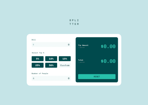
Responsive Tip Calculator app using JavaScript

Solution retrospective
While the logic of a tip calculator app isn't particularly complex, I'm happy with where I ended up with the separation of functions into a series of compact, specialized 'do-one-thing' functions.
What challenges did you encounter, and how did you overcome them?I went through several iterations of the form validation, eventually settling on an object to reference and hold the logic. Reviewing the 'refactoring your code' chapter of the JS fundamentals path was helpful in putting it all together.
What specific areas of your project would you like help with?I'm falling short with some accessibility features with this app and would need to spend a good deal more time on that aspect before feeling it's truly a production-ready site.
I also don't like leaving empty elements (p tags for the error messages in this instance) as part of my markup. A future iteration of the project would be to enhance the code to dynamically create/remove the elements as part of the error messaging rendering functions.
Finally, I spent some time working on a currency auto-formatting function for the bill amount input but it didn't make it into the project just yet. Again, that's a candidate for future enhancements.
Please log in to post a comment
Log in with GitHubCommunity feedback
No feedback yet. Be the first to give feedback on Matt Pahuta's solution.
Join our Discord community
Join thousands of Frontend Mentor community members taking the challenges, sharing resources, helping each other, and chatting about all things front-end!
Join our Discord