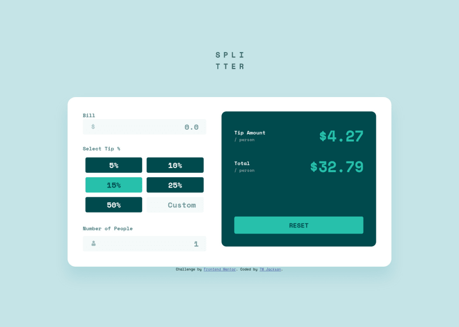
Responsive tip calculator app using HTML5, CSS3, and JavaScript
Design comparison
Solution retrospective
Feedback is welcomed π
Community feedback
- @grace-snowPosted almost 3 years ago
It's really important to use buttons for actions and anchor tags for links.
Also, the most important information on the page has been hidden from search engines and screenreaders. Is this product called "logo"?
Your other obvious report errors can be fixed by amending the ID/for attributes
Marked as helpful0 - @anoshaahmedPosted almost 3 years ago
To get rid of the accessibility/HTML issues shown in your Report:
- wrap everything in your body in
<main>
... OR use semantic tags ... OR giverole=""
to the direct children of your<body>
... Click here to read more - have at least one
<h1>
in your code <section>
and<article>
usually need a heading; so if you don't need a heading in it, use some other element such as<div>
Great job! :)
Marked as helpful0@grace-snowPosted almost 3 years ago@anoshaahmed try not to suggest role. That's rarely if ever the right way to go. Using the element itself is the solution 99.999999% of the time and messing with roles can introduce problems as I'm sure you know
1@anoshaahmedPosted almost 3 years ago@grace-snow Oh, I actually didn't know it could introduce problems. I was suggesting that so they could easily add it, without having to make changes to their html AND to their css.
Thank u for letting me know! I will keep that in mind from now on.
0 - wrap everything in your body in
Please log in to post a comment
Log in with GitHubJoin our Discord community
Join thousands of Frontend Mentor community members taking the challenges, sharing resources, helping each other, and chatting about all things front-end!
Join our Discord