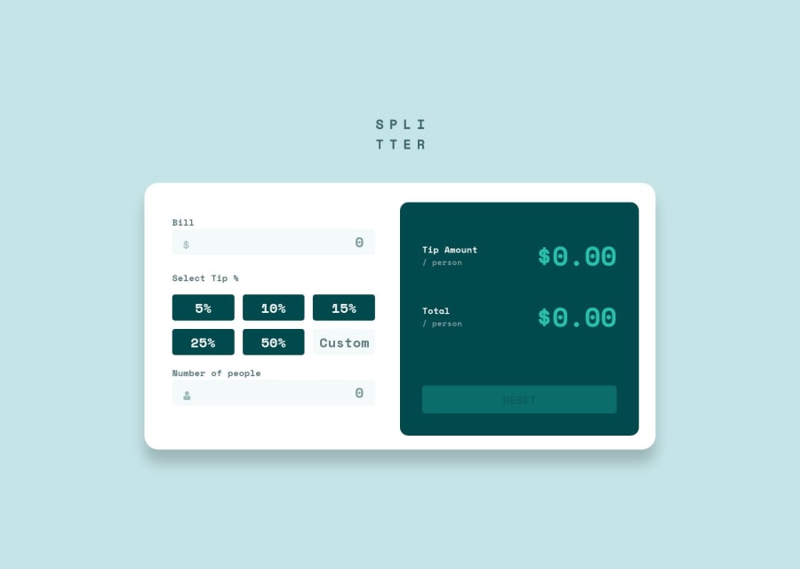
Responsive tip calculator app using HTML, CSS, JS, Grid and Flexbox
Design comparison
Solution retrospective
Any feedback is appreciated.
Community feedback
- @RoksolanaVeresPosted over 1 year ago
Hi, Yassine! I've recently completed the same challenge and got interested in your solution to find out how else I could have handled the inputs and get the desired result. Should admit that your way of using the onchange event on the form element looks more reasonable than applying the focusout event on each input as I did 🙂
Anyway, the problem I encountered while testing your app is that it doesn't handle the cases when a user types 0 in the bill and people inputs. If you type 0 in both inputs, you get the result "$NaN" in the "Tip amount" and "Total" fields. When you set a valid value to the bill input but then type 0 in the people input, you get "$Infinity" as a result of the calculation.
This issue is easy to fix by adding additional conditions for bill.value, like:
else if (bill.value == "0") {
    bill.style.border = "2px solid hsl(0, 88%, 66%)";
    error[0].classList.add("active");
    error[0].textContent = "Can't be zero";
    valid = false;
and the same for people.value:
else if (people.value == "0") {
    people.style.border = "2px solid hsl(0, 88%, 66%)";
    error[1].classList.add("active");
    error[1].textContent = "Can't be zero";
    valid = false;
and then you'll also need to add one more condition to check if the form is valid:
if (
    bill.value <= 500000 &&
    people.value !== "" &&
    people.value != "0"&&
    (checkedButton || customTip)
  ) {
    valid = true;
  }
I'm sorry if the solution to the problem was obvious enough to elaborate on it, but I just wanted to make sure you get me right 🙂
Marked as helpful0@Ryusuke66Posted over 1 year ago@RoksolanaVeres Hi, Roksolana It's great to hear from you! I'm glad you found my solution interesting and helpful. And thank you for taking the time to test the app and provide feedback.
Also don't worry at all – your explanation was clear and thorough. It's always good to share your insights and suggestions, even if they might seem obvious. It's through these discussions that we can learn from each other and refine our solutions. Happy coding!
1 - @TyubitPosted over 1 year ago
Awesome job! Looks exactly as design, animation, inputs works good. I found small CSS problem just in case if u want to improve the project. Reset button on preview website light green with black text. I'm using Chrome, btw.
1
Please log in to post a comment
Log in with GitHubJoin our Discord community
Join thousands of Frontend Mentor community members taking the challenges, sharing resources, helping each other, and chatting about all things front-end!
Join our Discord
