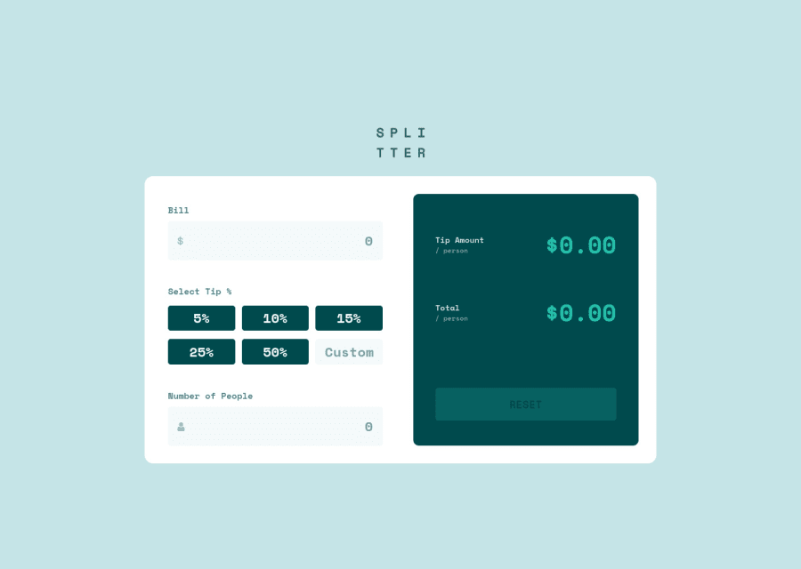
Responsive tip calculator app using CSS Flexbox, media query, and JS
Design comparison
Solution retrospective
Please provide feedback on how I can improve in JS. Took me quite awhile to replicate the design due to the measurements. Any feedback for that will be appreciated.
Community feedback
- @Richard2957Posted almost 3 years ago
Try adding some code like this:
body::after { position: absolute; content: ""; top: 0; left: 0; bottom: 0; width: 100%; height: 100%; background: url("./design/desktop-design.jpg") no-repeat; opacity: 0.3; z-index: -1; animation: myanim 1s alternate infinite ease; }
@keyframes myanim {
100% {
    opacity: .9;
}
}
body>* { opacity: 0.35; }
This will put a copy of the design in the background. You might need to adjust the opacity numbers a bit depending on what you're doing. The animation is to help distinguish 'your' website from the 'design'.
Hope that helps
Marked as helpful0
Please log in to post a comment
Log in with GitHubJoin our Discord community
Join thousands of Frontend Mentor community members taking the challenges, sharing resources, helping each other, and chatting about all things front-end!
Join our Discord
