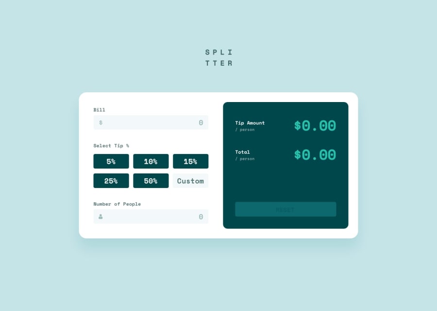
Design comparison
Solution retrospective
The solution did not perfect but I will try to improve it.
Community feedback
- @gerichilliPosted over 2 years ago
Hi Grizoba, congratulations on completing this project. I think your project will look better if you add some points
-
Adjust the font size to be larger, the font color to be the same as the design, make the padding of the buttons and inputs a bit larger.
-
You should wrap the inputs in a
formelement, use the calculate button for submitting the form and the reset button for resetting the form, I think using the semantic element and taking advantage of the built in function for the form in JS will help the code neater and easier to understand and manage. -
In the Select Tip % section, I think it will be more suitable for the form if you use
<input type="radio">elements with the same name. And to make them look like the design, you can hide these radios and show them by their labels. You can refer how to do it here, although it is a bit different, but the way to do it is similar [How To Build Tabs only with CSS](https://medium.com/allenhwkim/how-to-build-tabs -only-with-css-844718d7de2f) -
Finally, I think you should round Tip Amount and Total because in case of irrational numbers, their length will break the layout.
Have a nice day and happy coding
Marked as helpful0@Florent-RICHARDPosted over 2 years ago@gerichilli Thank you for all your advice. This will help me a lot.
0 -
Please log in to post a comment
Log in with GitHubJoin our Discord community
Join thousands of Frontend Mentor community members taking the challenges, sharing resources, helping each other, and chatting about all things front-end!
Join our Discord
